Pitney Bowes — Corporate Icons
Pitney Bowes is an American provider of global eCommerce solutions, shipping and mailing products, location intelligence, customer engagement and customer information management solutions.
The agency FutureBrand New York led the redesign and communication of the brand. They commissioned us to create, under their art direction, the corporate icons together with the necessary guidelines to generate new future icons.

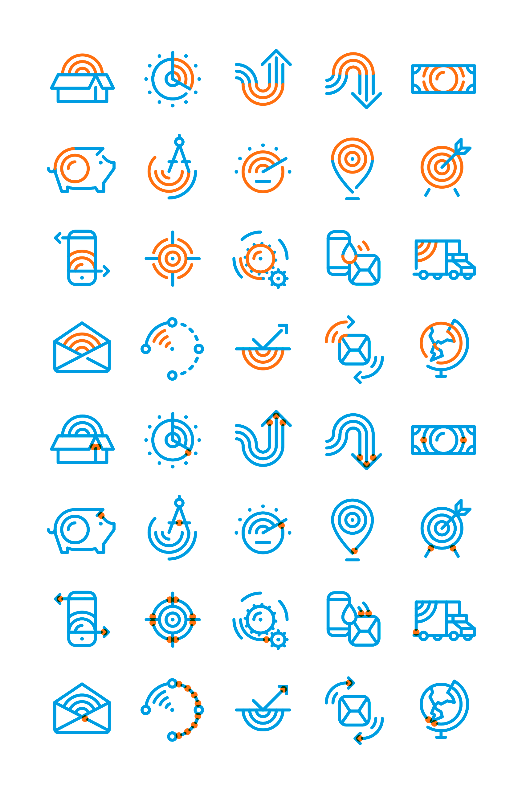
The family of icons are divided in two very distinctive categories: “Brand icons”, used in communications, most of which are aimed to transmit the benefits of their services and need higher detail, and “Functional Icons”, which represent a range of functions, actions, services and navigation elements, which have to be very simple, fast reading and optimal readability in small sizes.






For the creation of the new family of icons for Pitney Bowes we relied on the main features of their new imagotype. We created a grid on which to draw in one line thickness, maintaining the essence and finish of the imagotype.
For “Brand Icons” we created a circular grid, with the same number of concentric circles within the structure of the Pitney Bowes imagotype, and a simplified grid for “Functional Icons”.
The differential aspect of “Brand Icons” was that part of the grid is present in each one of them. Sometimes it is more visible than others, sometimes partially hidden from view, but always present. This way we created a graphic element that makes each and every one of the icons designed relate to each other, this being their common denominator, and also a link to the essence of the brand.
In the Pitney Bowes imagotype there are graphic criteria which have also been respected and are present in all the icons designed: open lines (line breaks) and the rounded ends of the lines.
