Barraquer Ophthalmology Centre
The Barraquer Ophthalmology Centre is a leading medical institution for the prevention, diagnosis and treatment of eye conditions. Backed by 80 years of experience and a multidisciplinary team of more than 30 highly qualified ophthalmologists, Barraquer has strengthened its position as a centre of excellence in its sector.
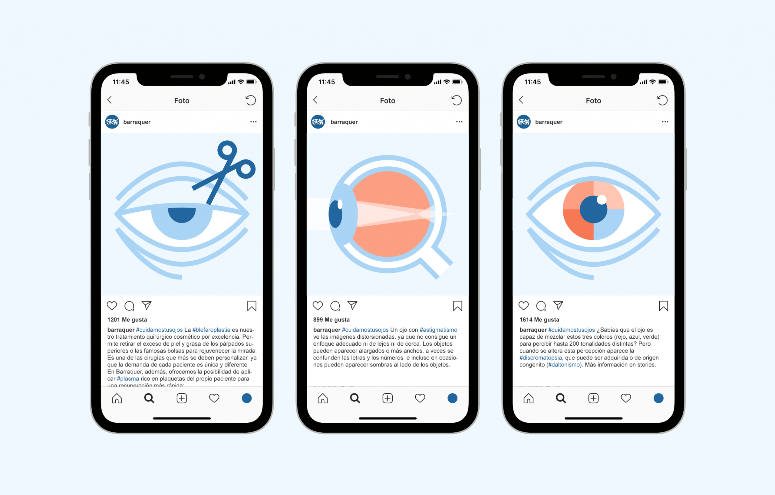
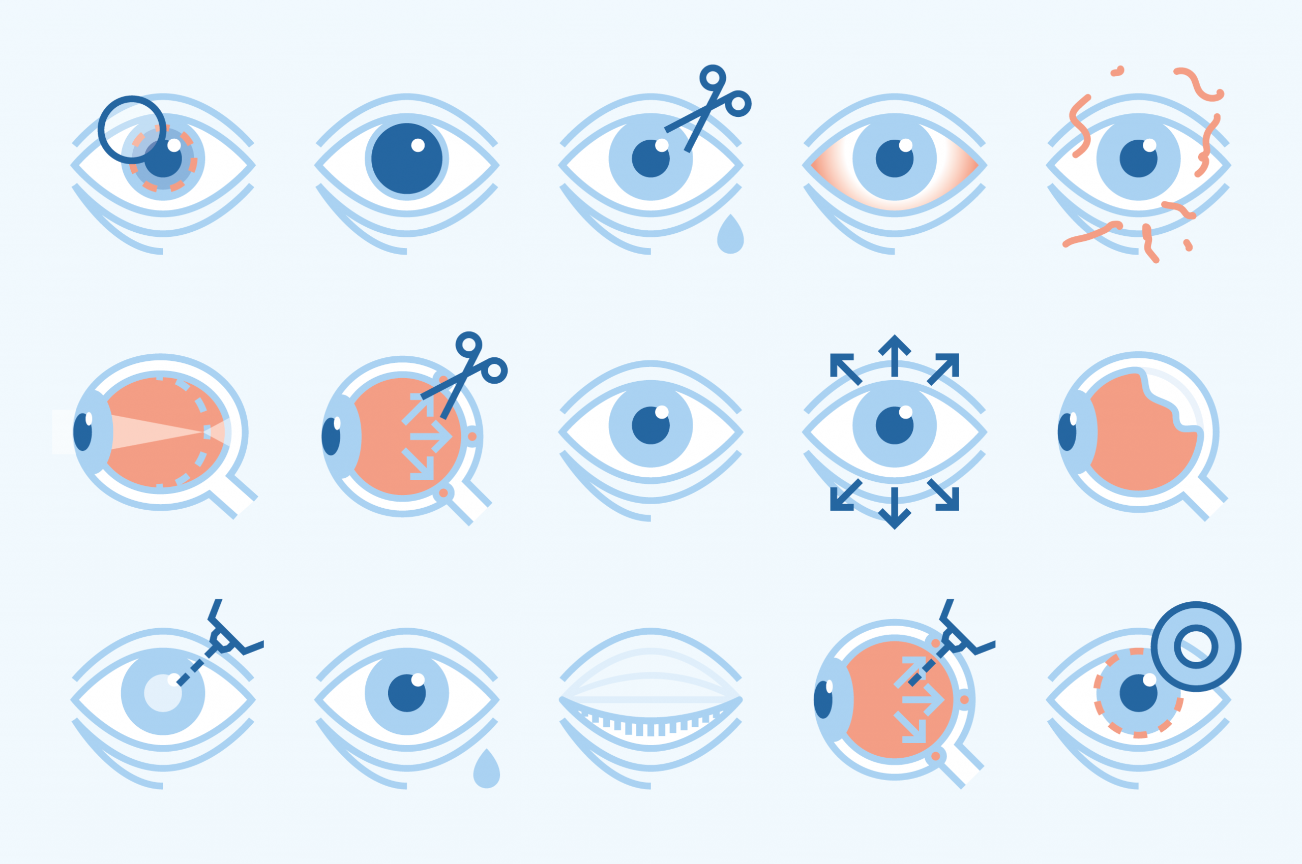
As part of our ongoing work with them, we have refined their symbol, rationalized their corporate applications and brand manual, designed several editorial pieces or illustrated more than 70 pathologies and treatments.
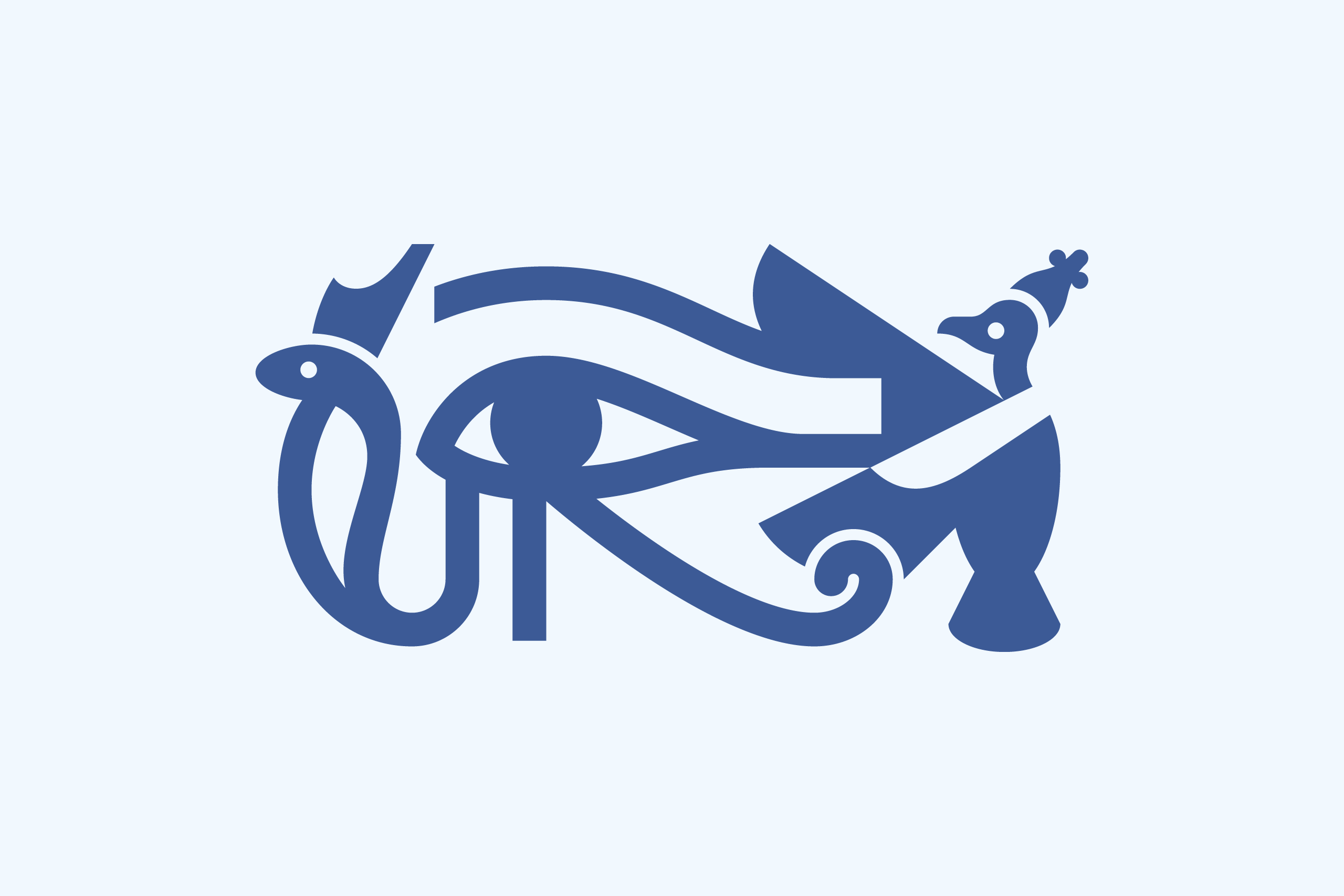
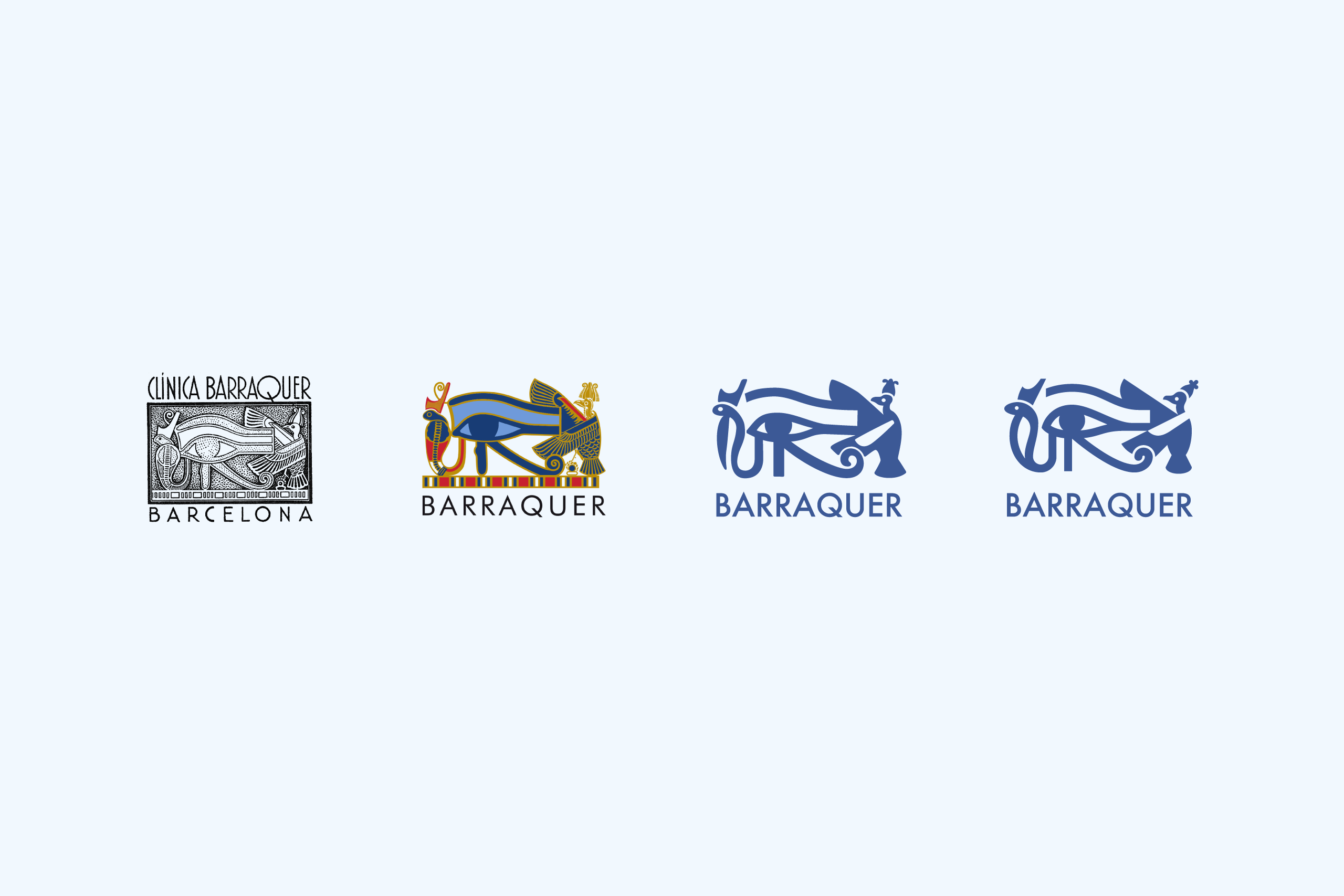
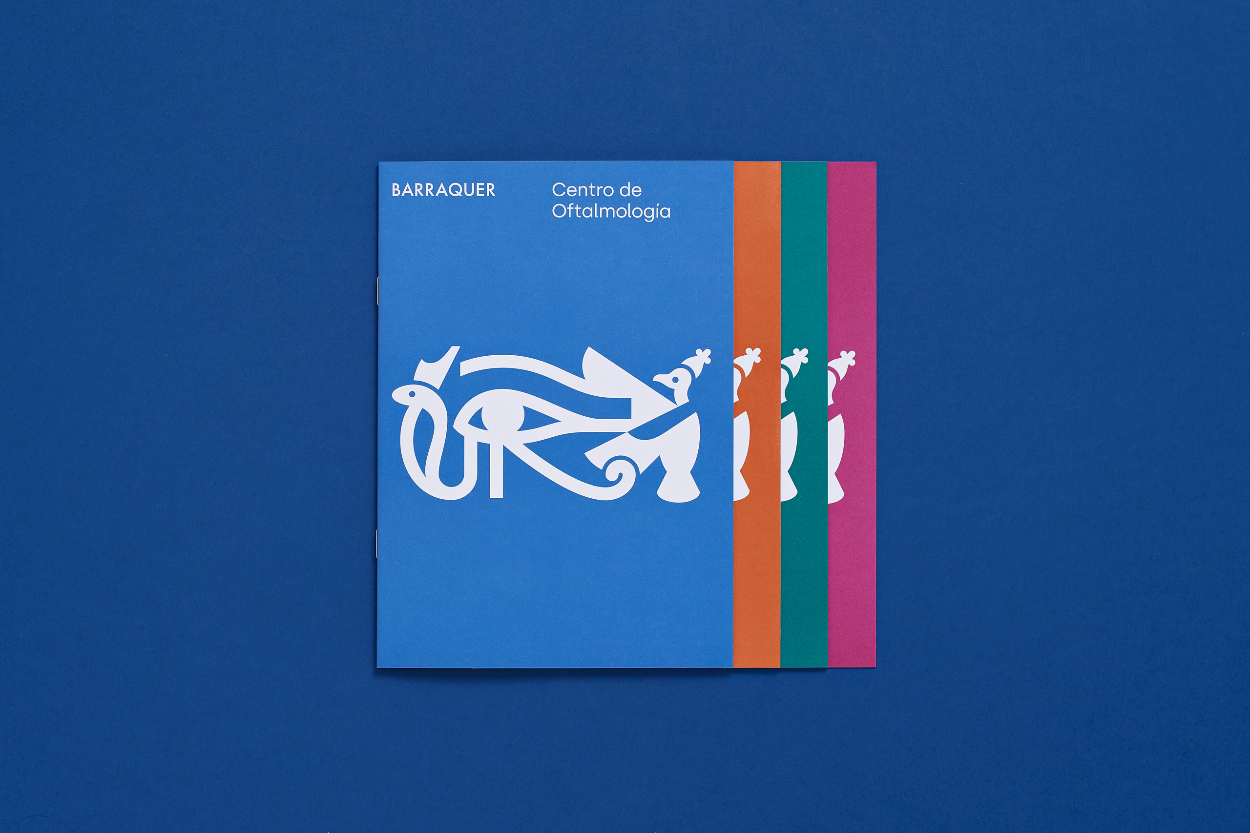
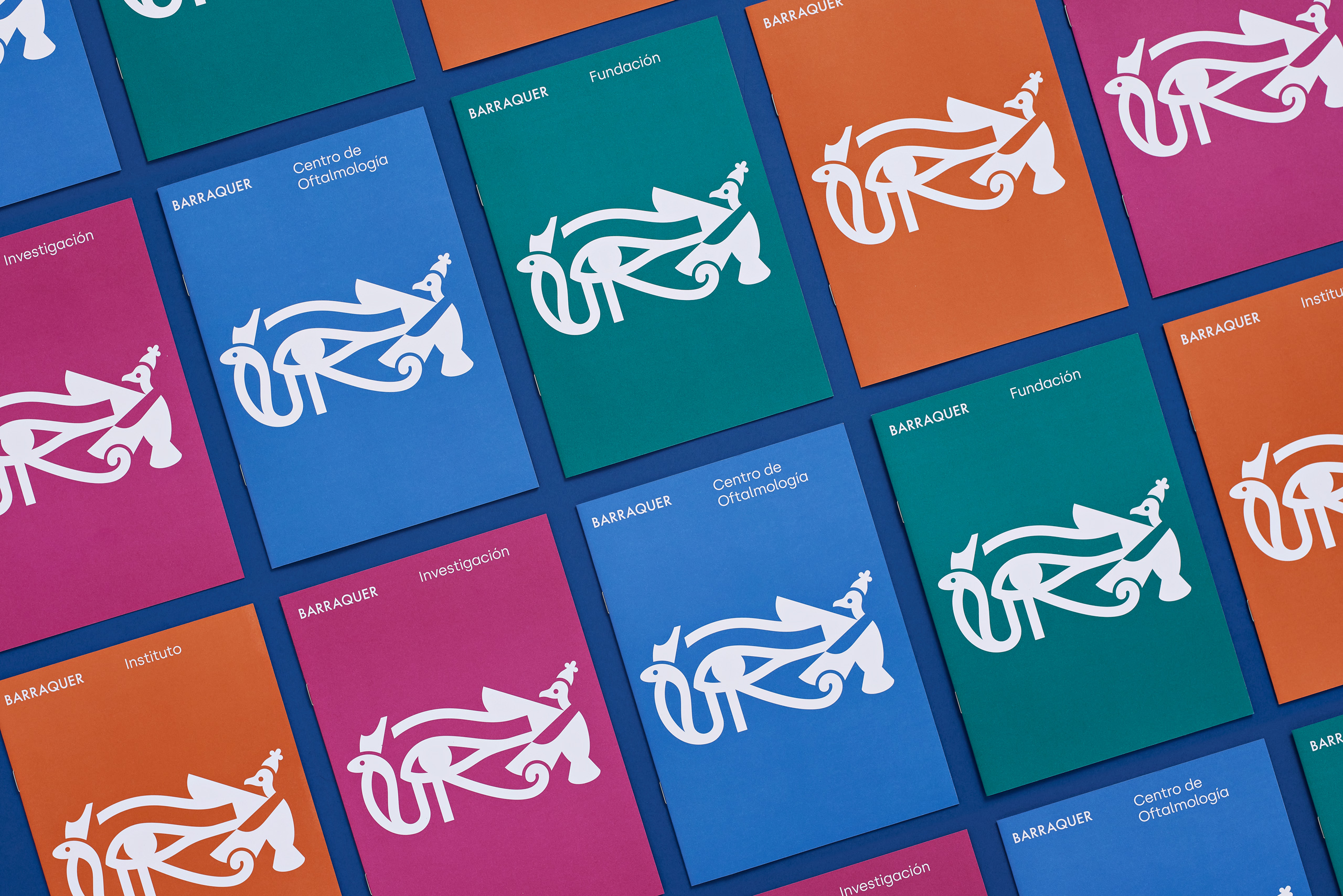
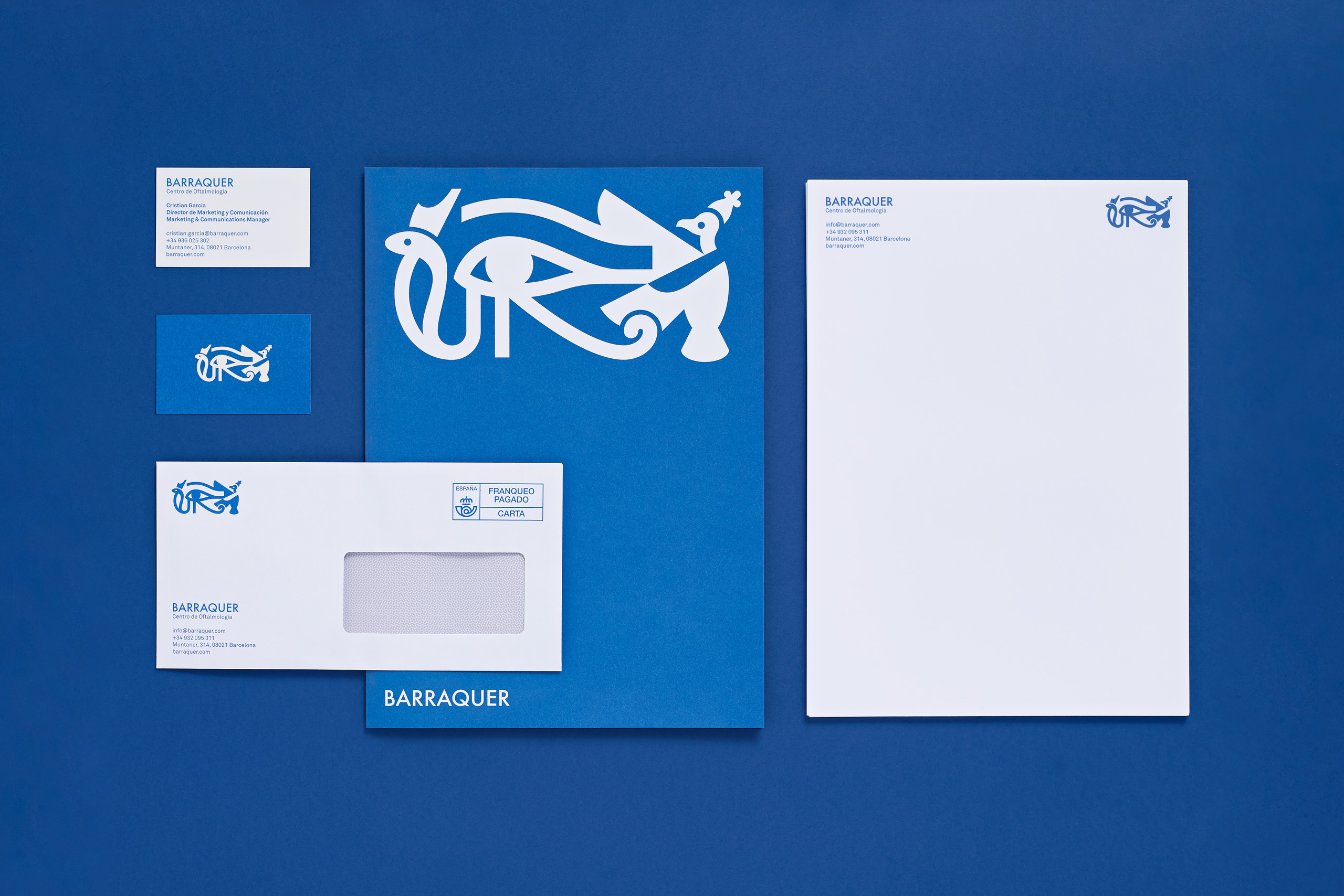
Symbol Refinement
More than a conceptual or creative challenge, our work on the symbol was interesting for its technical aspects. We had to adapt a complex and wobbly symbol to an extremely geometric and cohesive one without losing any detail or charm. We also had to balance the combination of line and fill, the three objects at different scales, etc.
Finally, we had to improve some of the technical requirements that any big brand demands to its symbol, such as comprehensibility or reductibility.
Stationery and Editorial Pieces
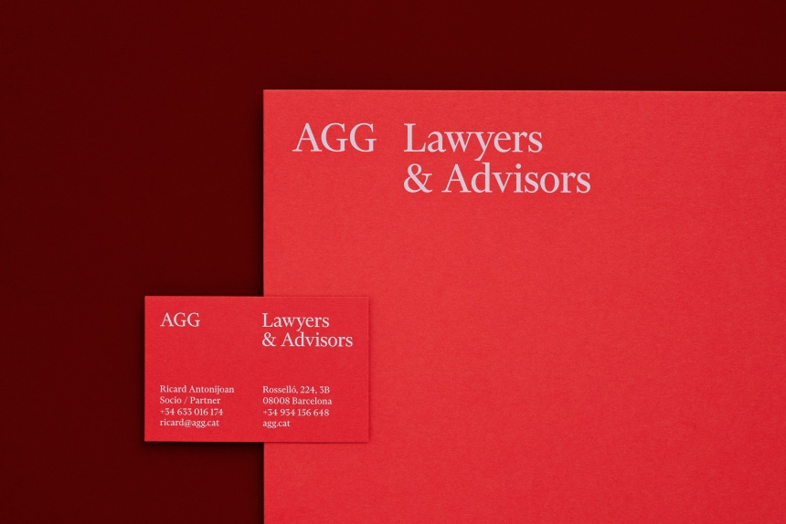
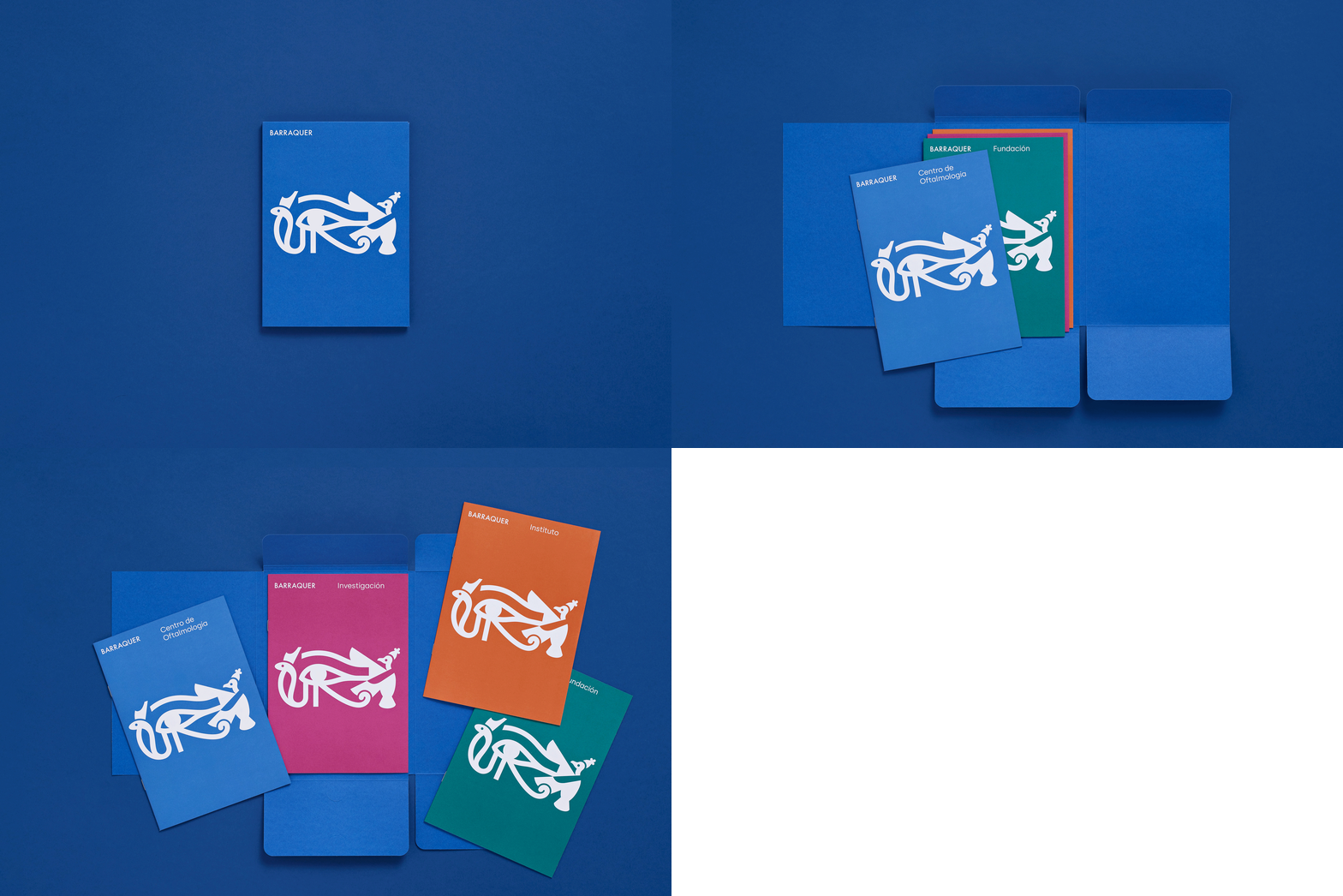
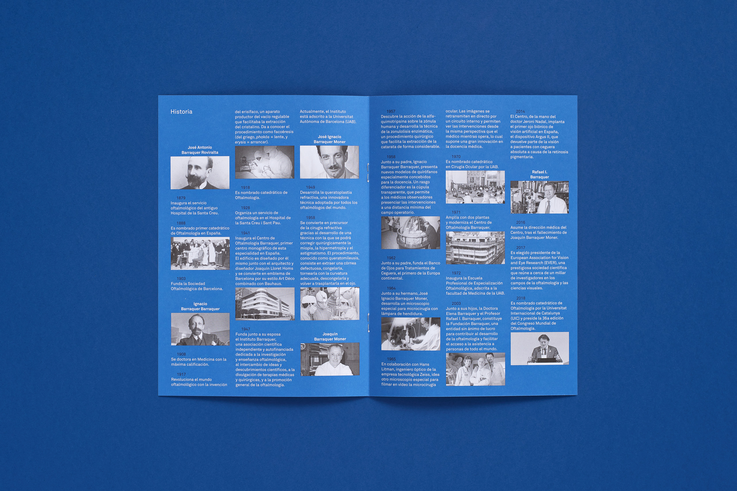
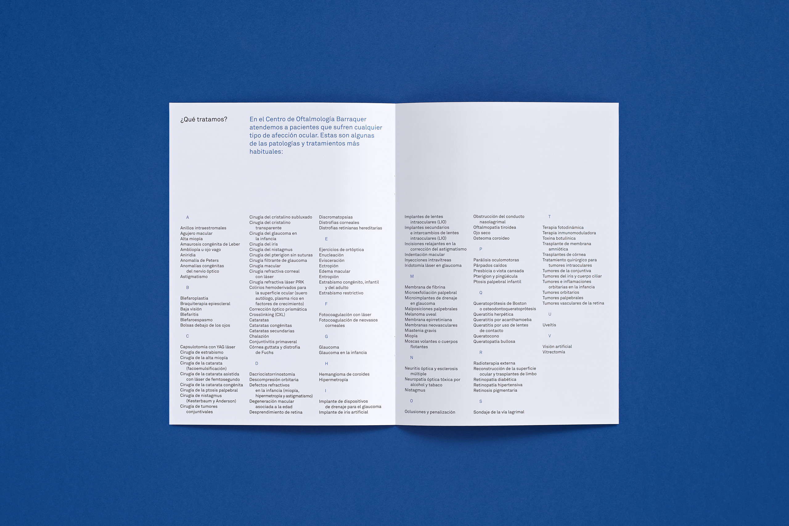
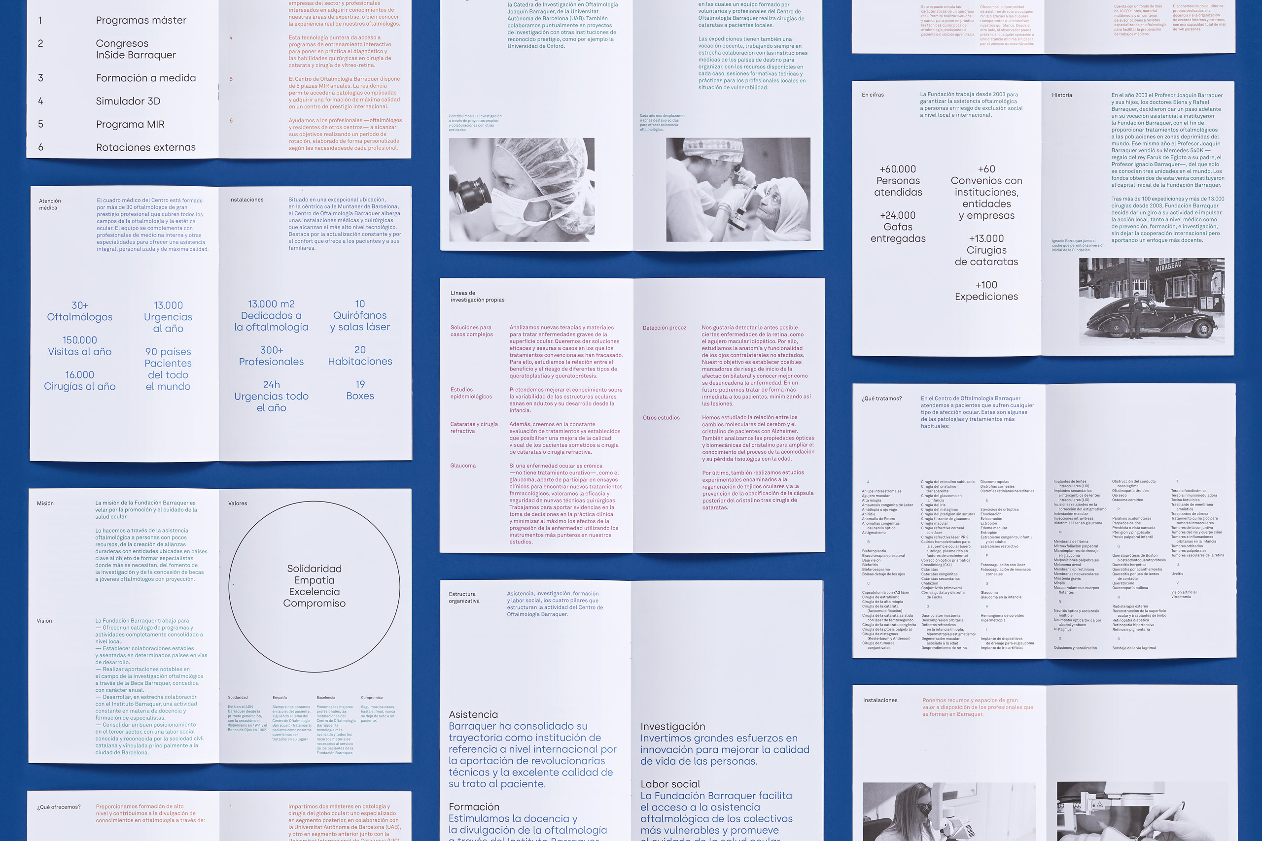
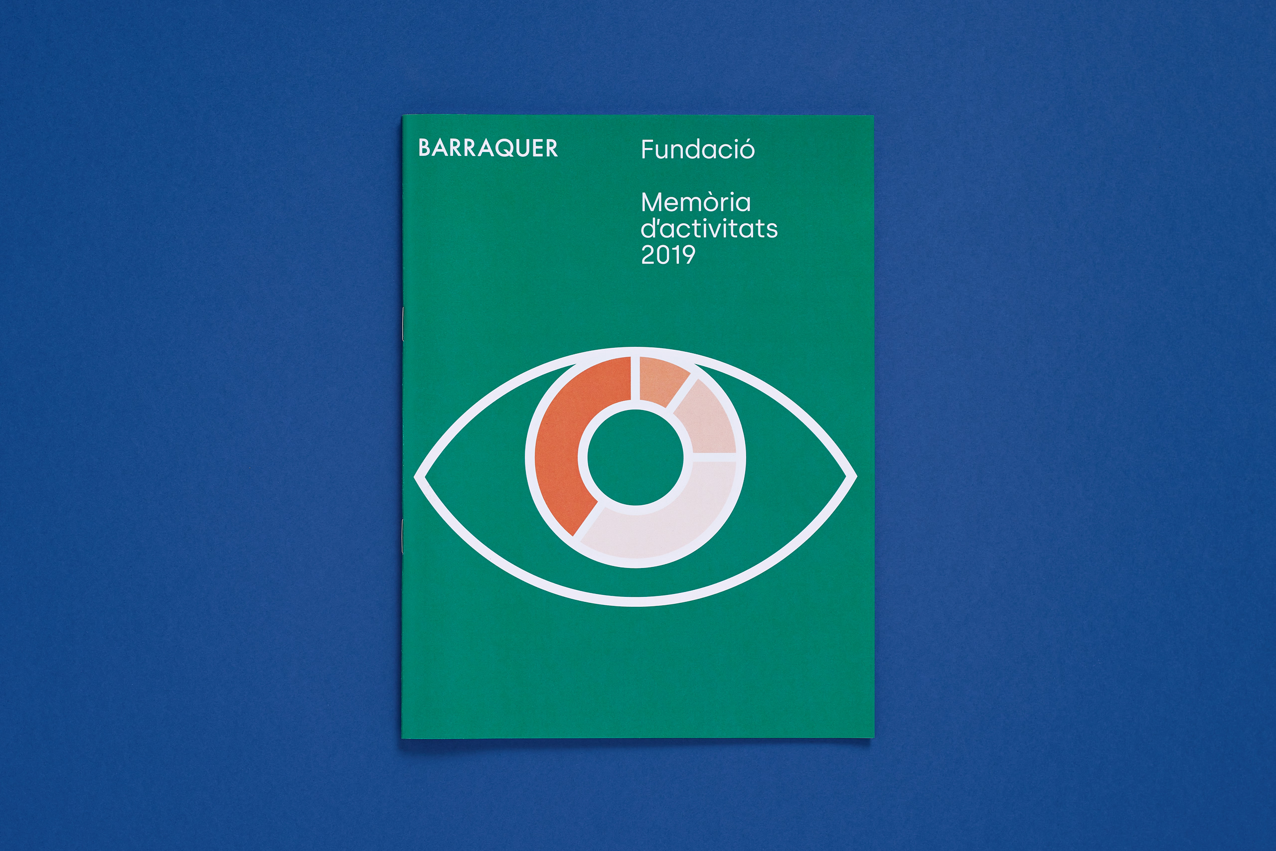
Using their existing brand assets, we brought order to chaos by designing a series of editorial pieces, stationery and communication elements. These will be the cornerstone of the new brand applications to come.
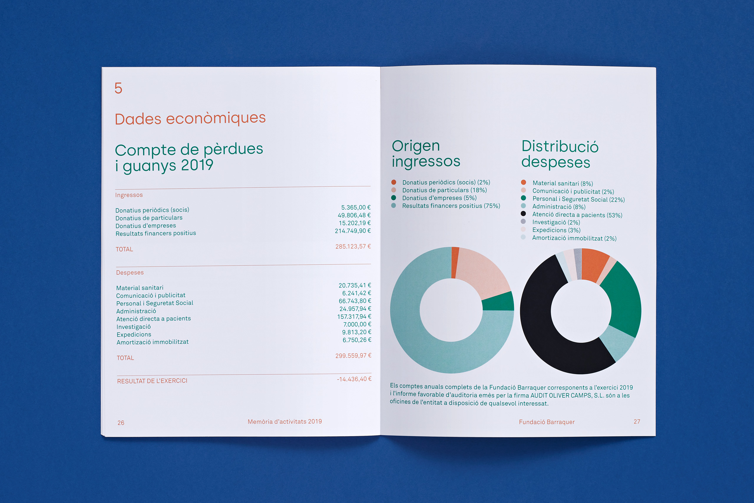
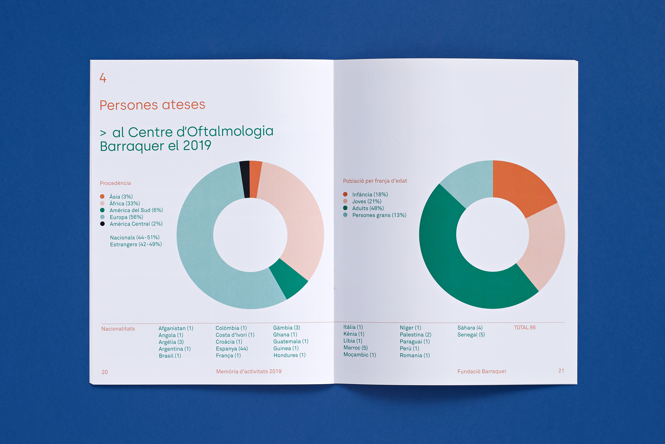
Barraquer Magazine Covers
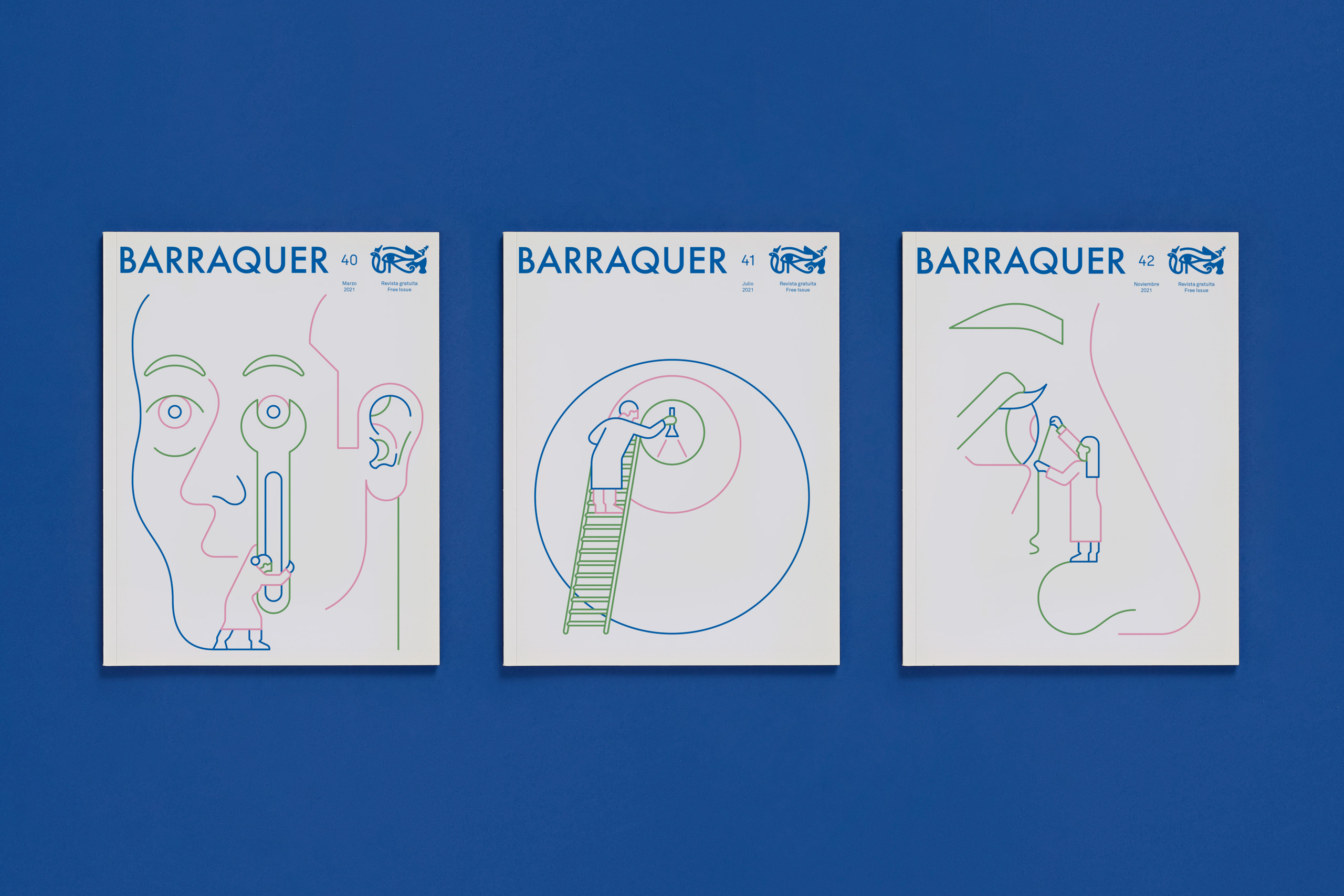
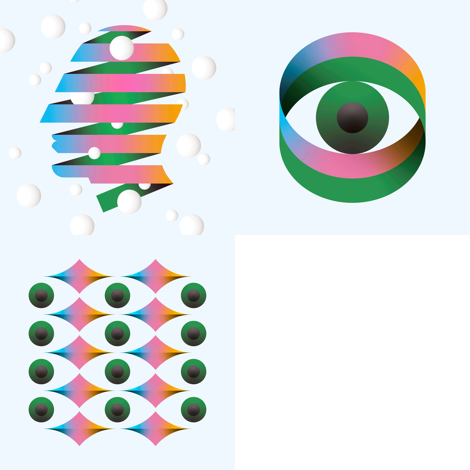
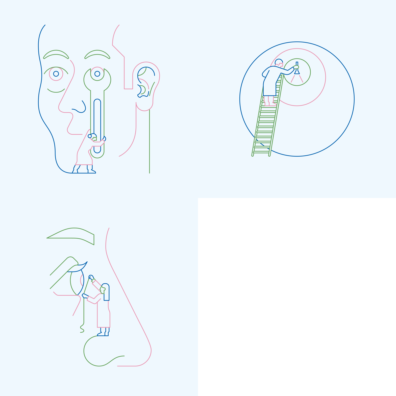
We designed all the covers of Barraquer Magazine’s 2020 and 2021 issues. For each year we explored a different topic and illustration style, treating these covers as yearly series.
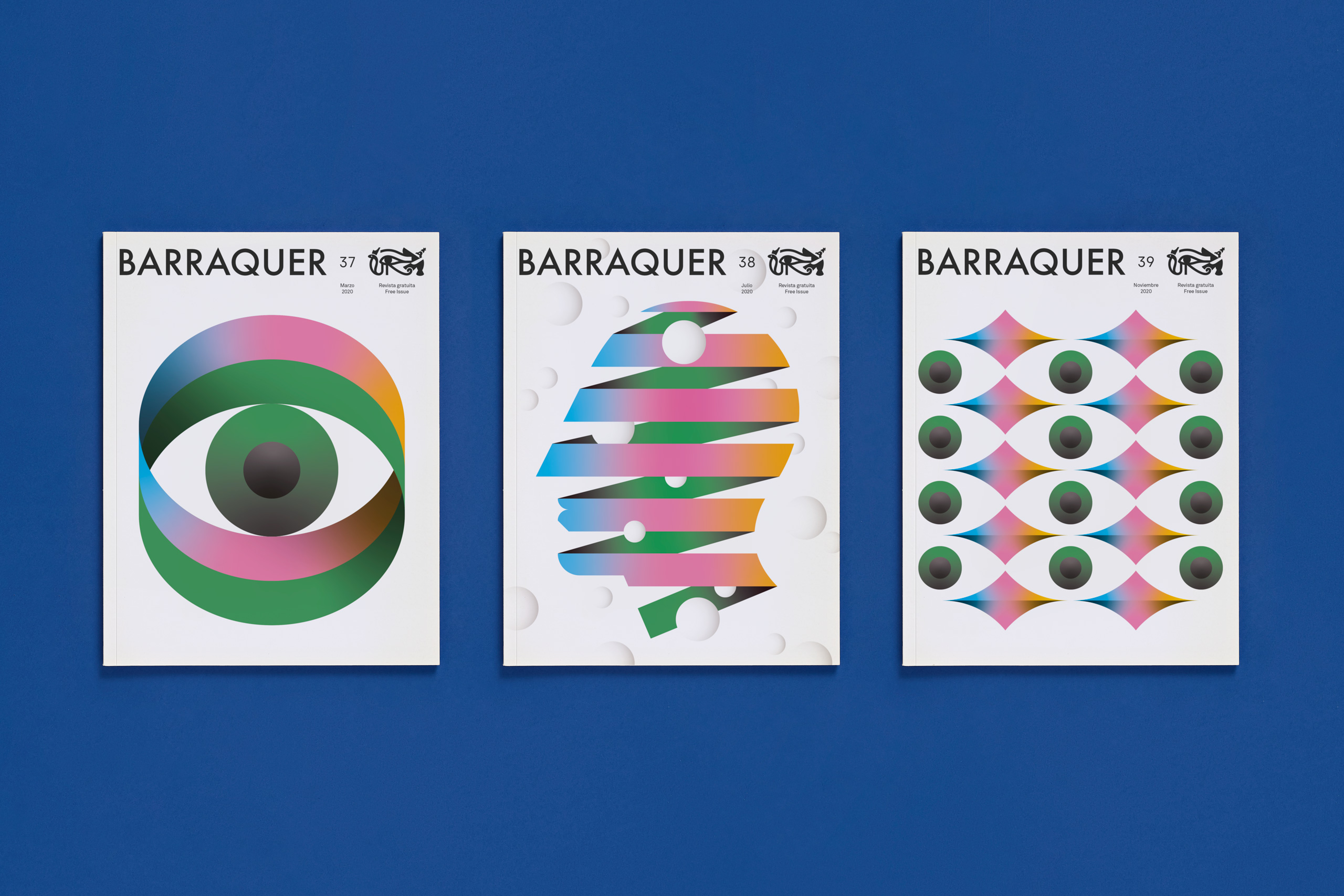
One of the magazine’s most popular sections is dedicated to optical illusions and artists. Thus, we made the 2020’s series of covers a tribute to M.C. Escher.
2021 was the 80th anniversary of the center. As a wink to its history, we made a series of illustrations around the concept of the ‘Ophthalmology Craftsmen’
80th anniversary campaign
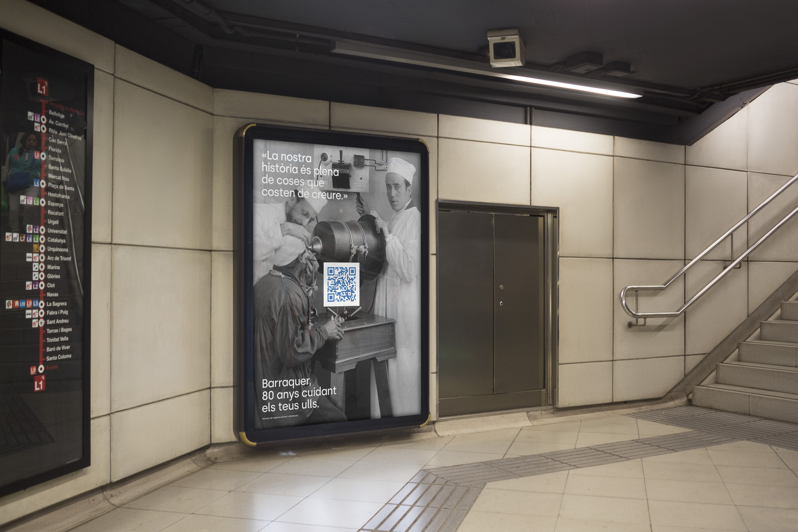
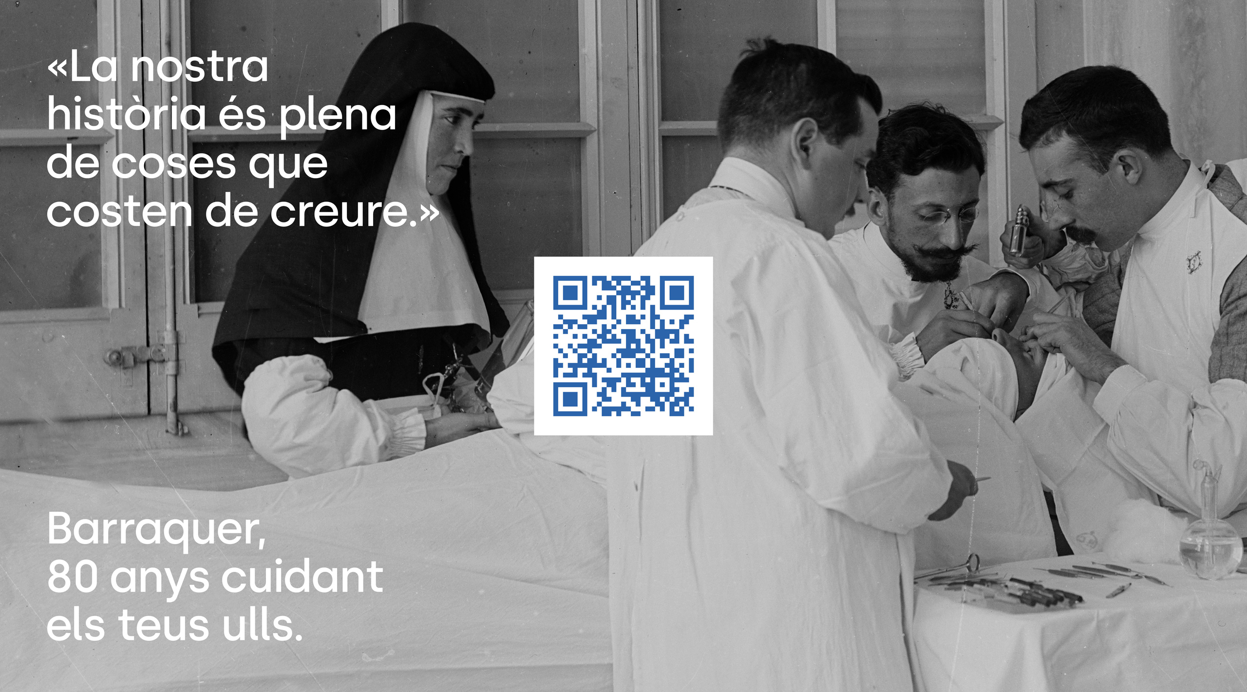
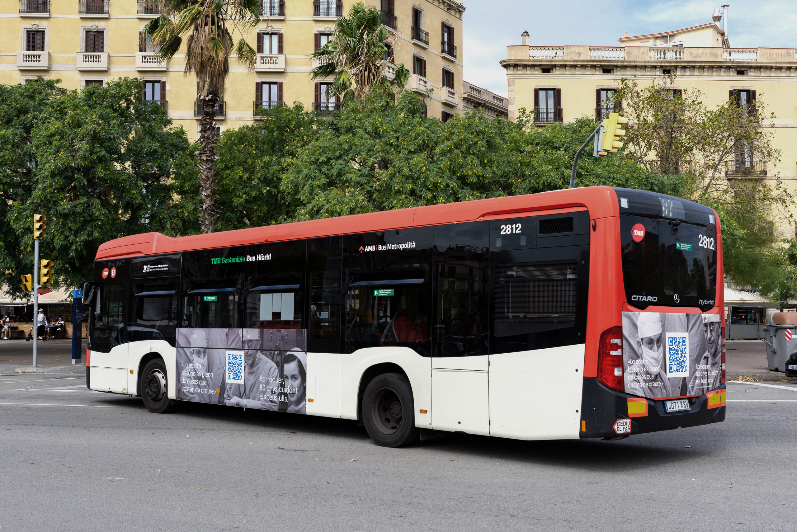
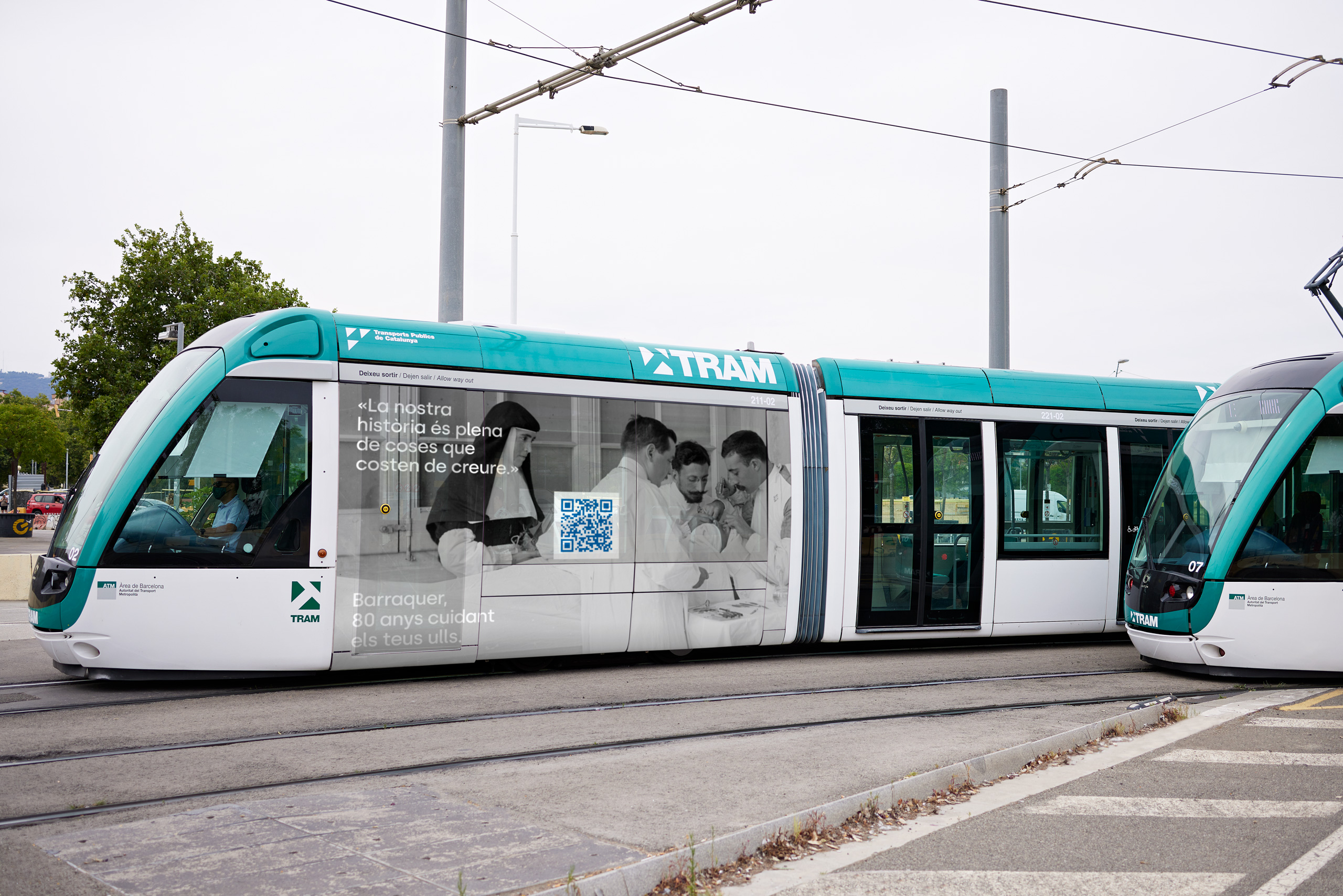
In collaboration with the great Codea, we created a campaign to celebrate the center’s 80th anniversary. Using a cinematic approach, Codea created a wonderful piece that celebrates the genius and uniqueness of this familiar company, its members and the building itself.
The graphic applications are an open invitation to enjoy the video, as there is not a single image or tagline capable of summarizing all the anecdotes and characters that appear in it.
Illustrations
We were commissioned to create an illustration language capable of synthesizing and representing more than 100 pathologies and treatments. The client asked for non-explicit, warm and synthetic illustrations that could be easily understood by both professionals and clients.
