Dell — Illustration exploratory
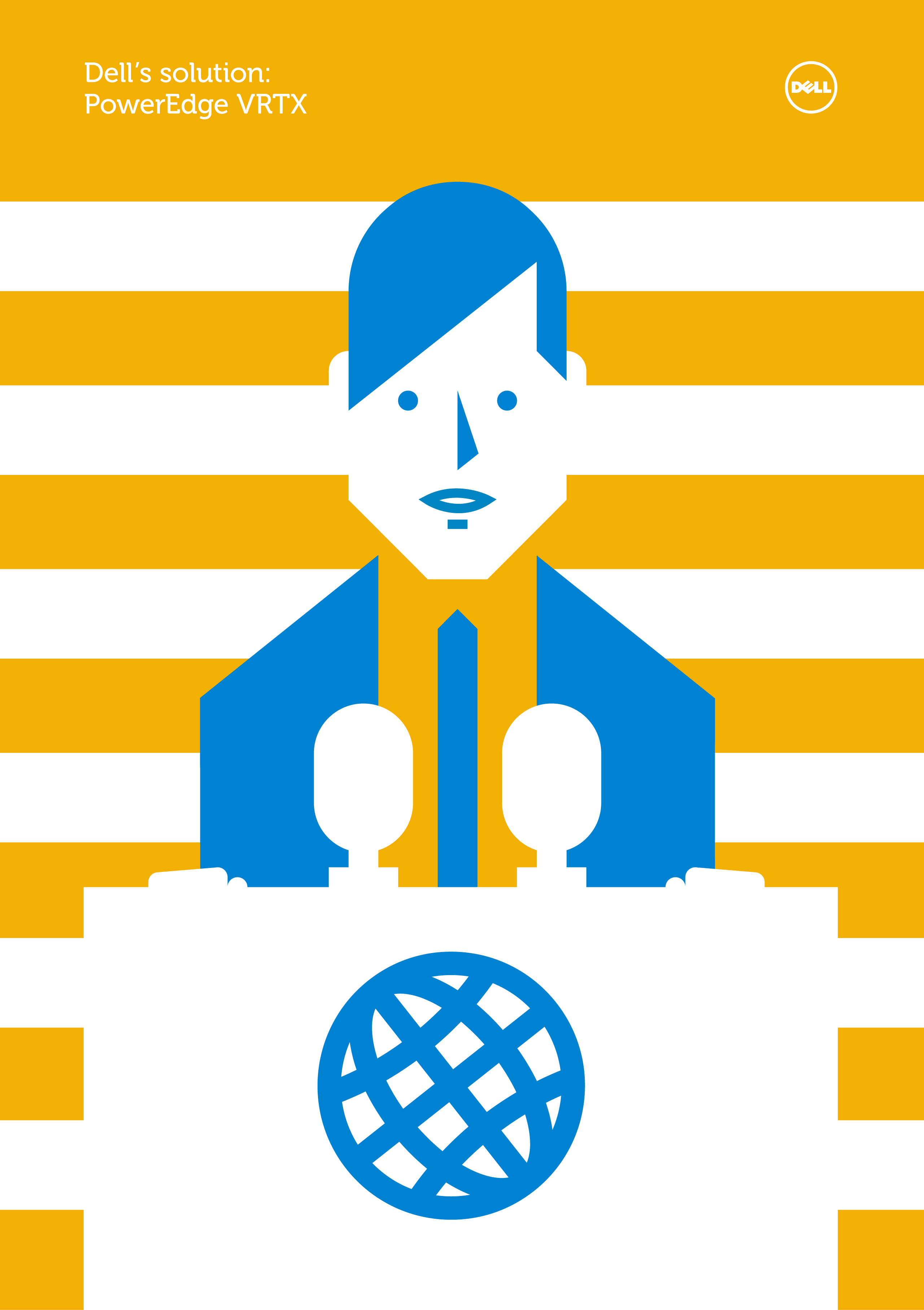
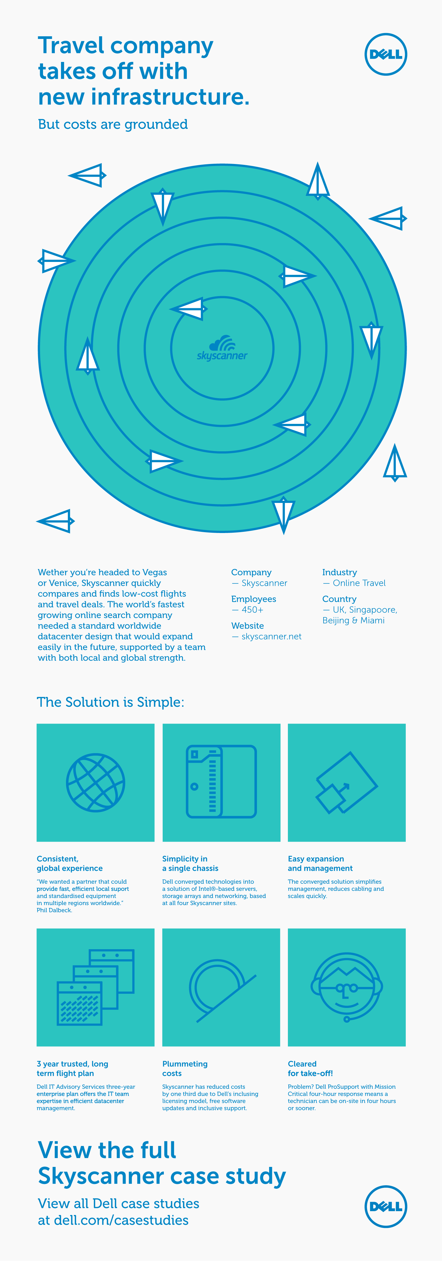
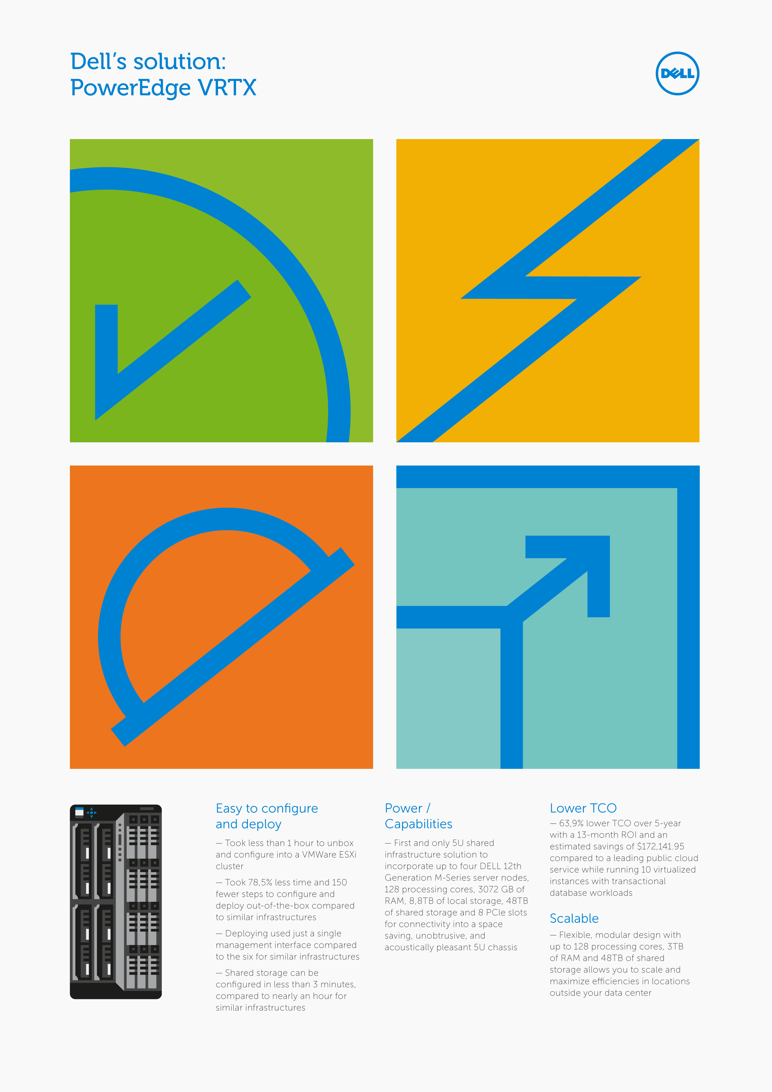
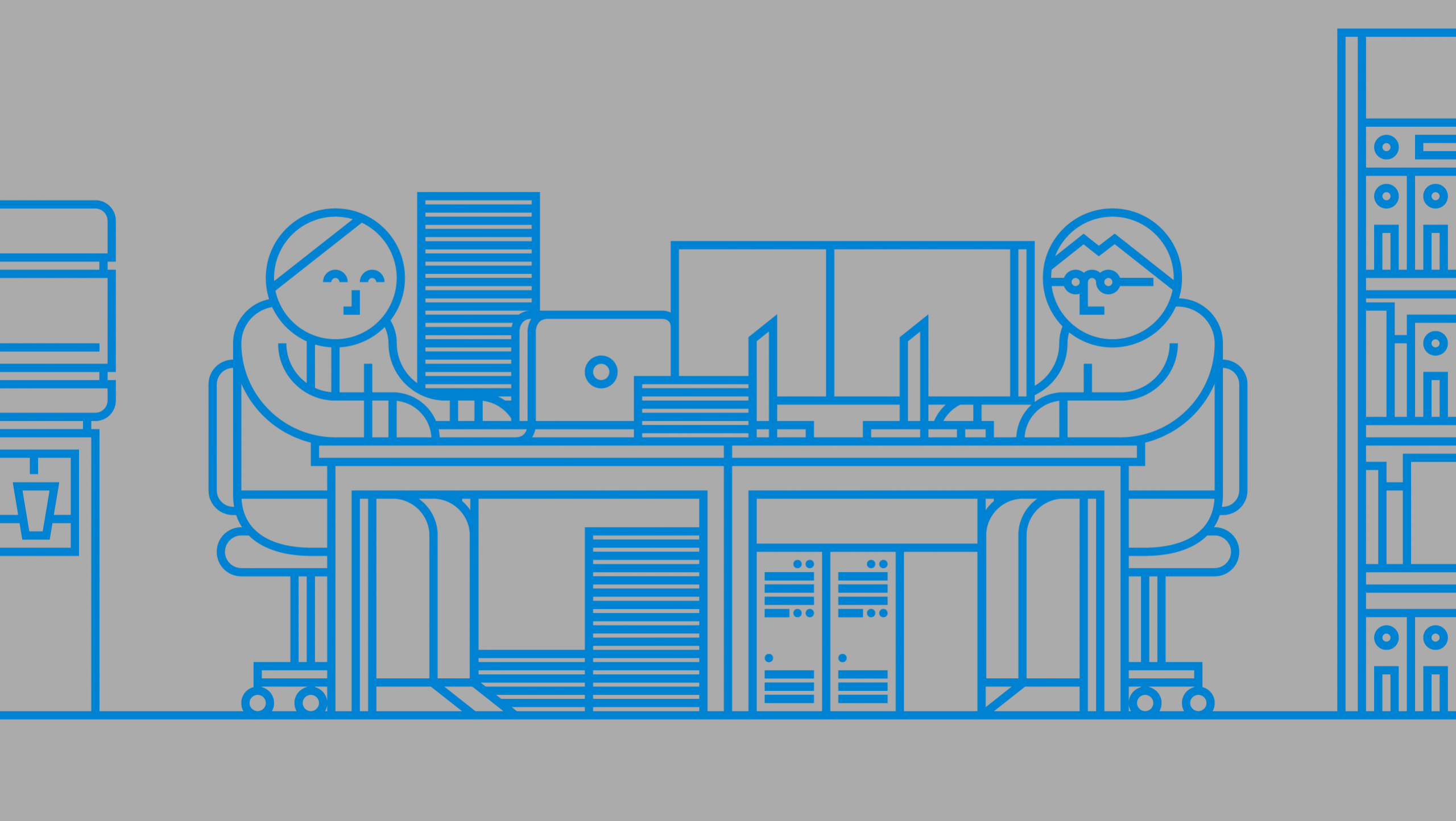
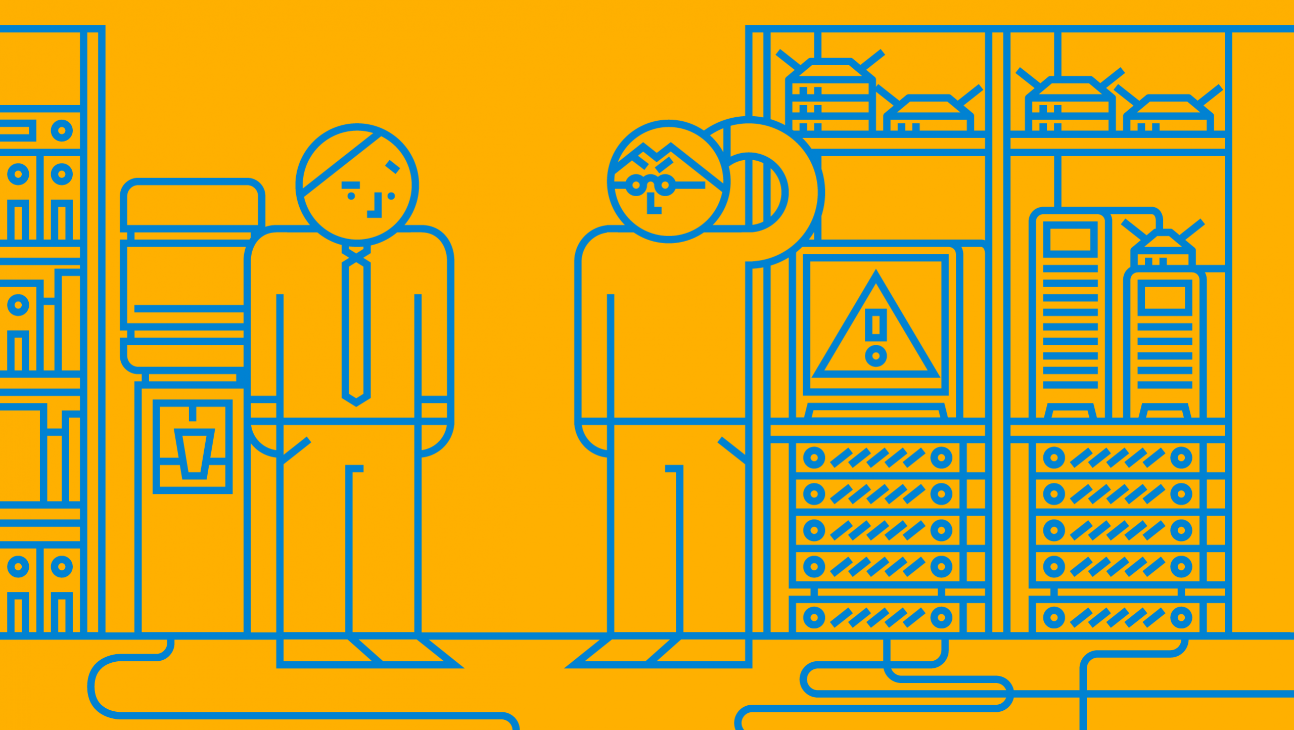
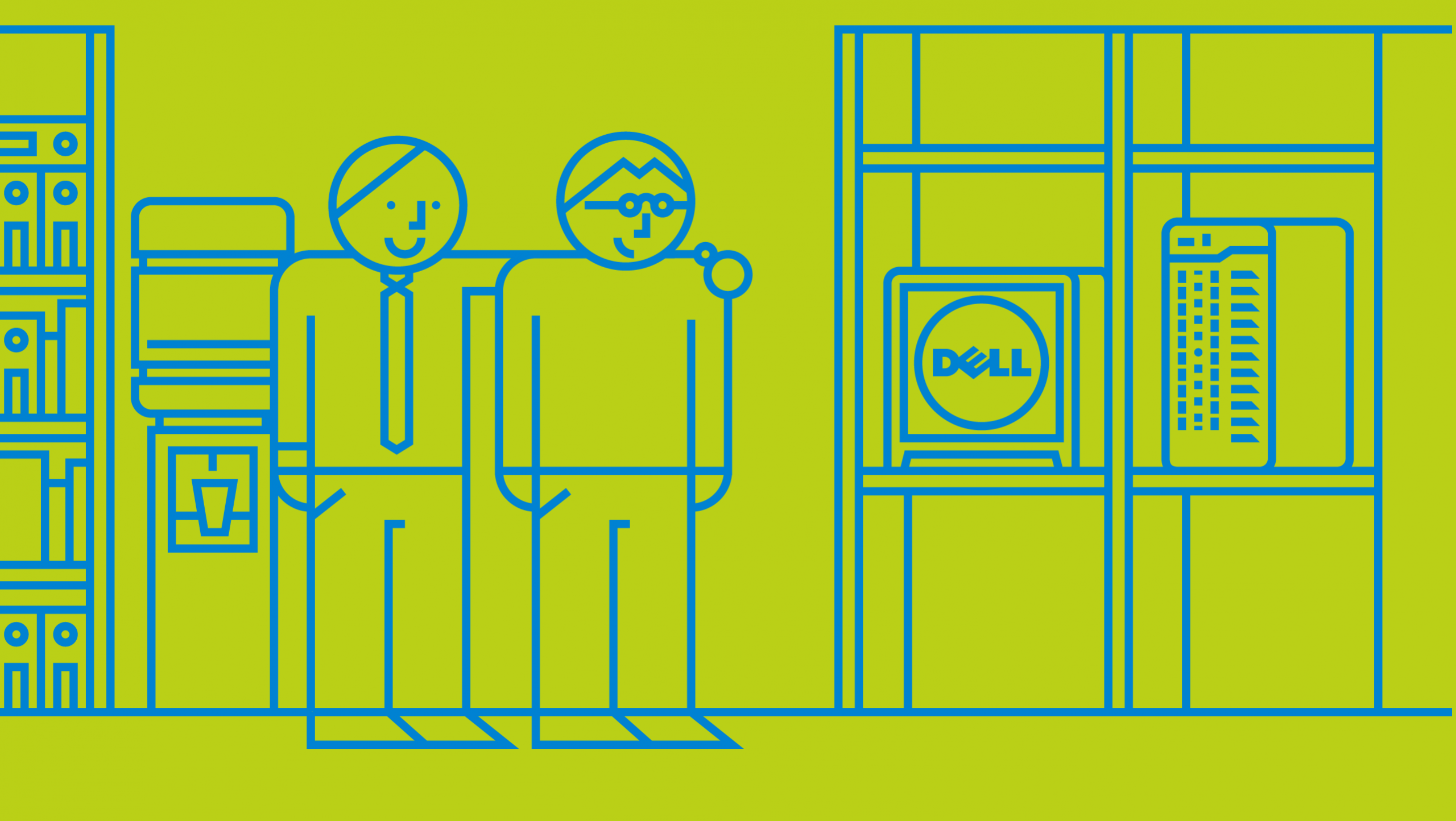
The agency Y&R New York, under their art direction, asked us to explore the corporate illustration language of Dell, the US multinational dedicated to the development, manufacture and sale of personal computers, servers, software and all kinds of technology products.
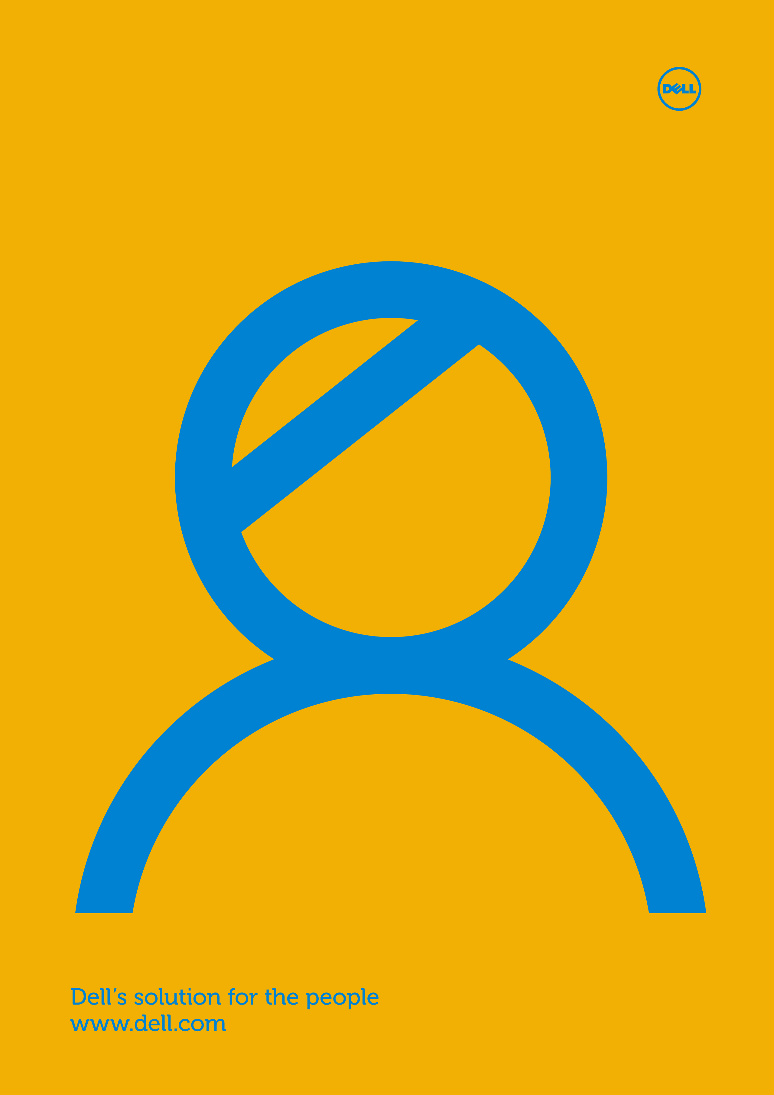
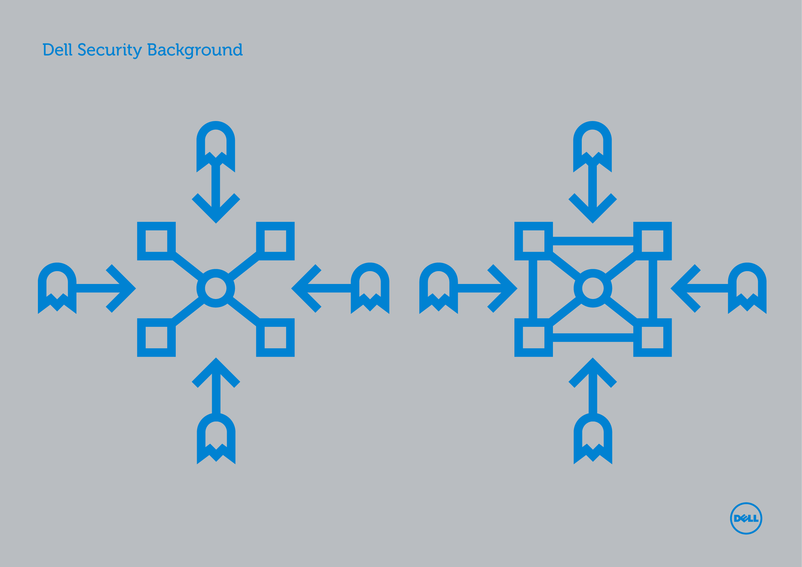
The visual language should contain the DNA of the brand and be simple, direct, accessible and optimistic. The main objective: make the complex simple. The language should be long term, and work on all kinds of formats: digital, print, animations, etc.

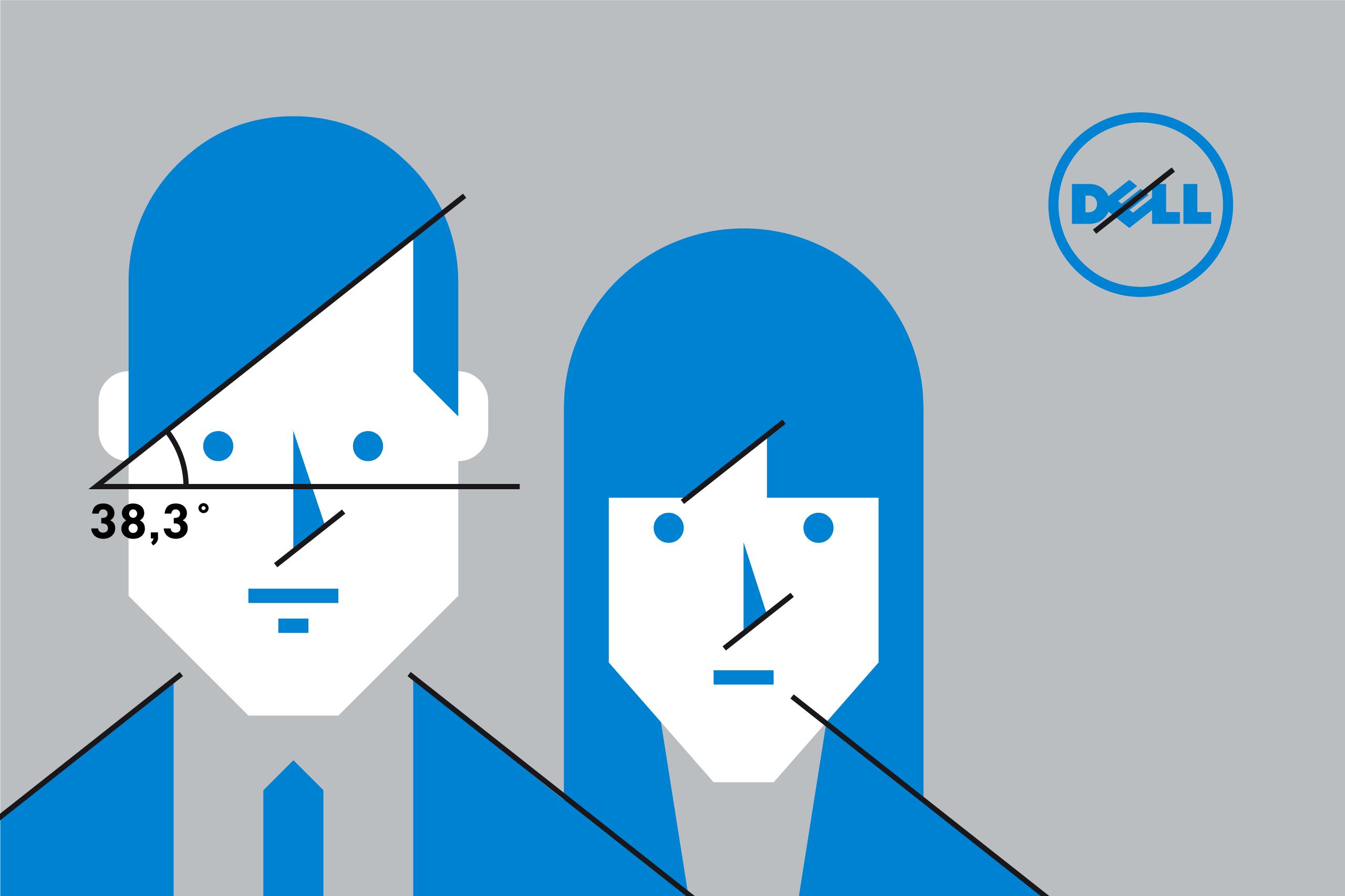
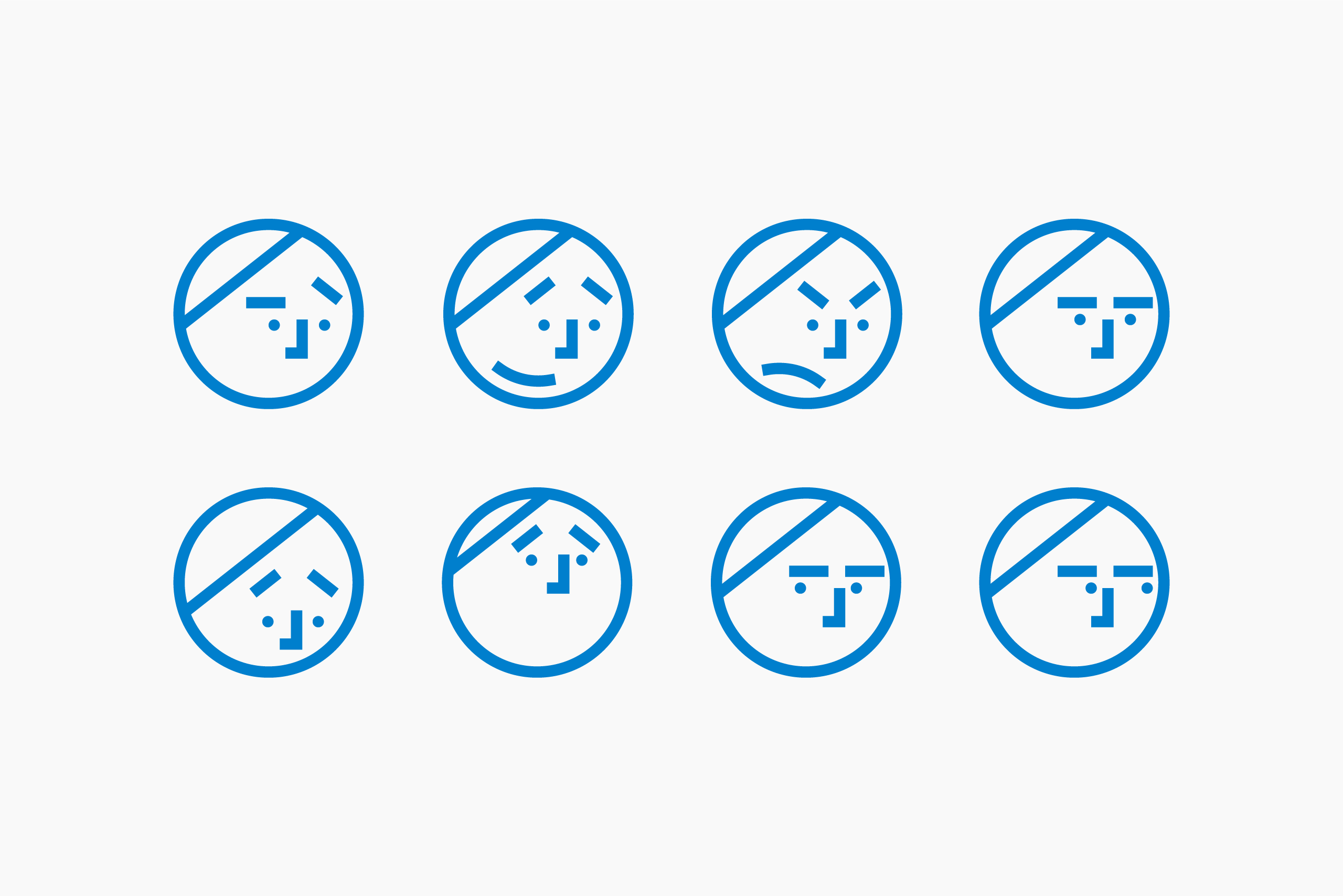
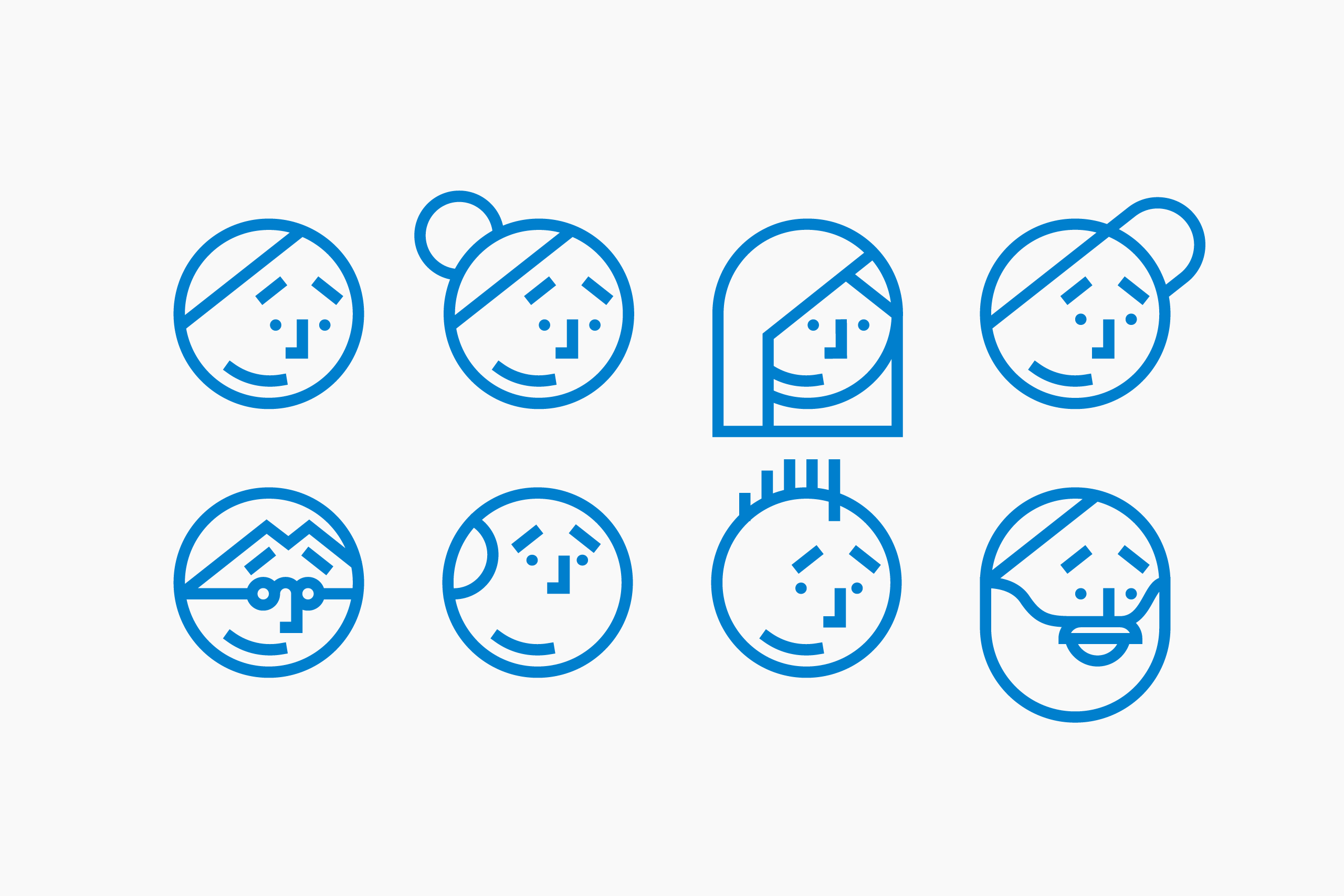
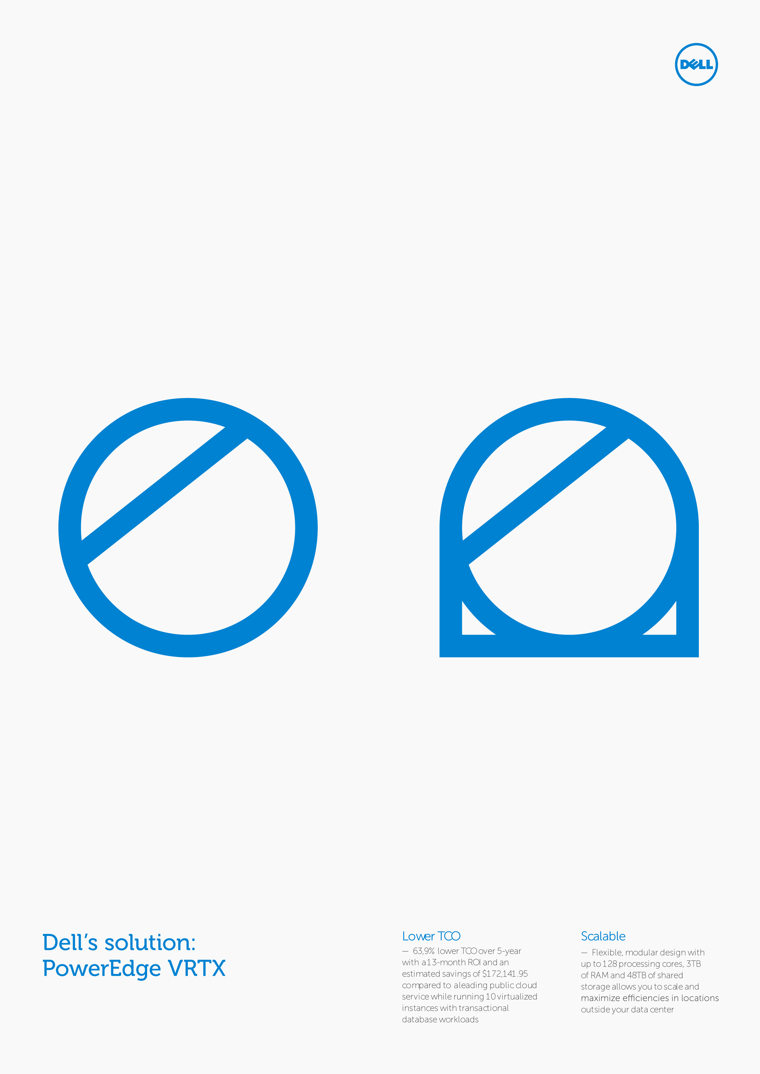
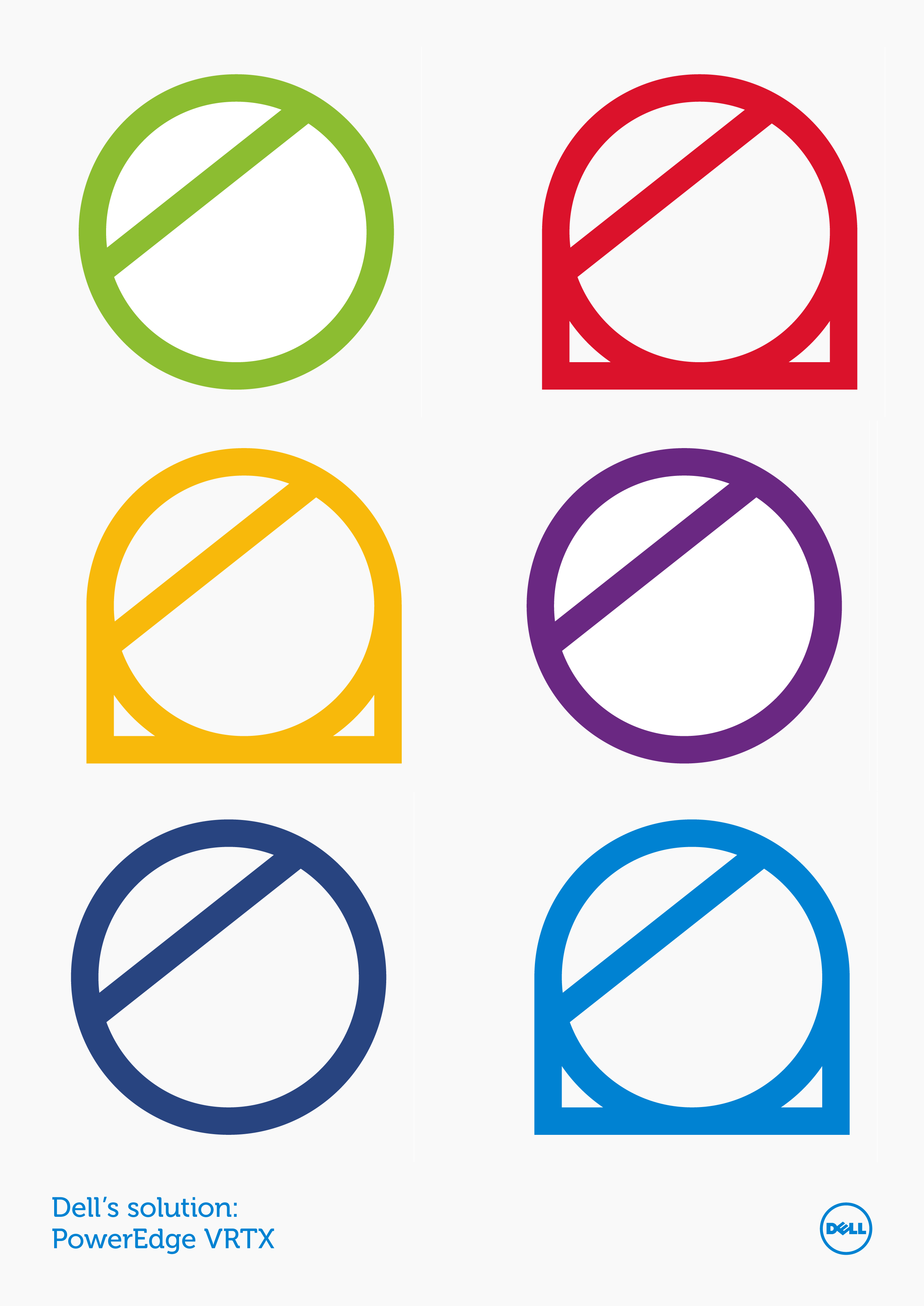
In search of the new visual language we relied on some features mentioned on the corporate manual. Besides its colors and fonts, in particular, we focused on the power of the stroke on the outer circle of the logo and the particularity of the letter “E”, which has an angle of 38.3 °, a very characteristic slant pointed out in the corporate manual. We projected all visual diagonals with this inclination, giving them a greater role and generating a direct link with the brand.
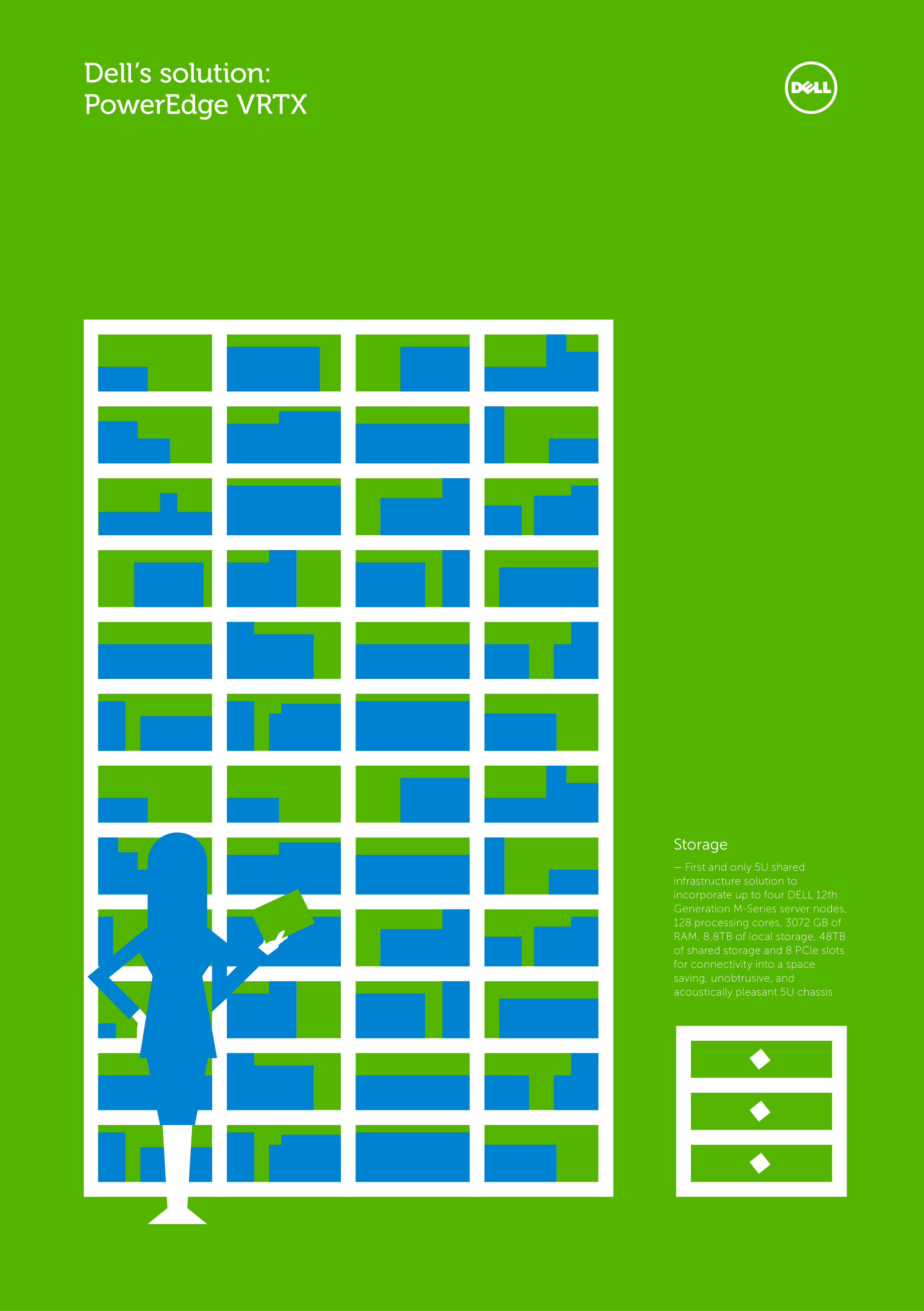
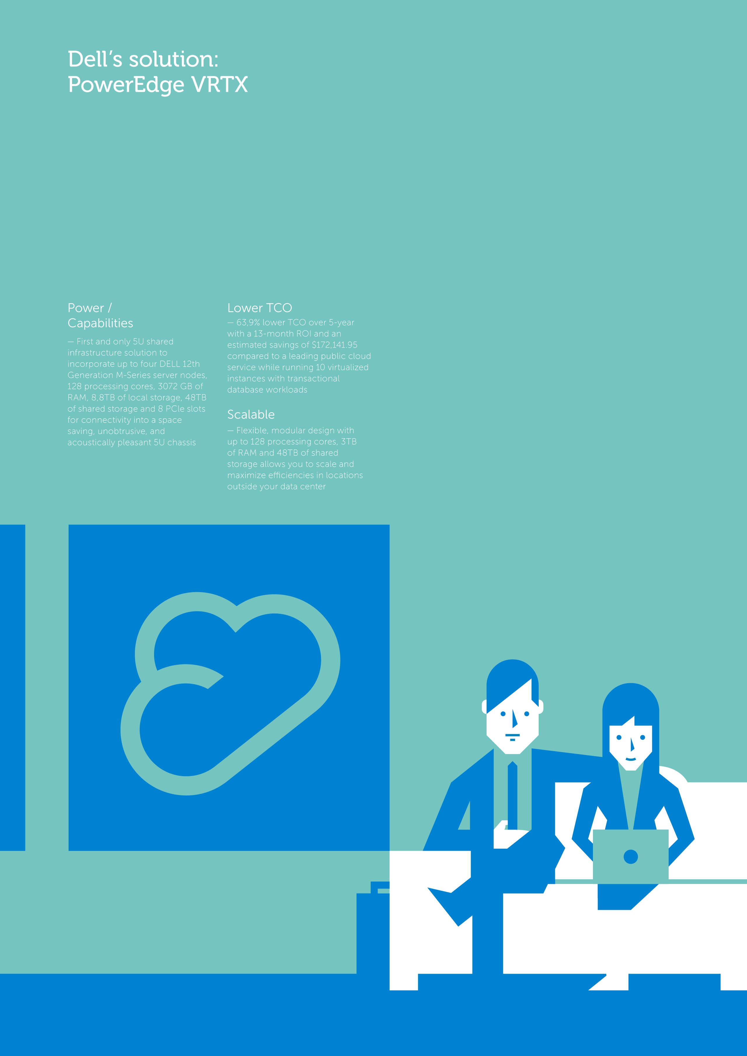
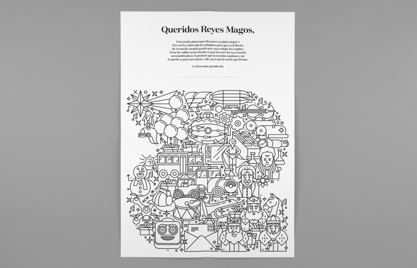
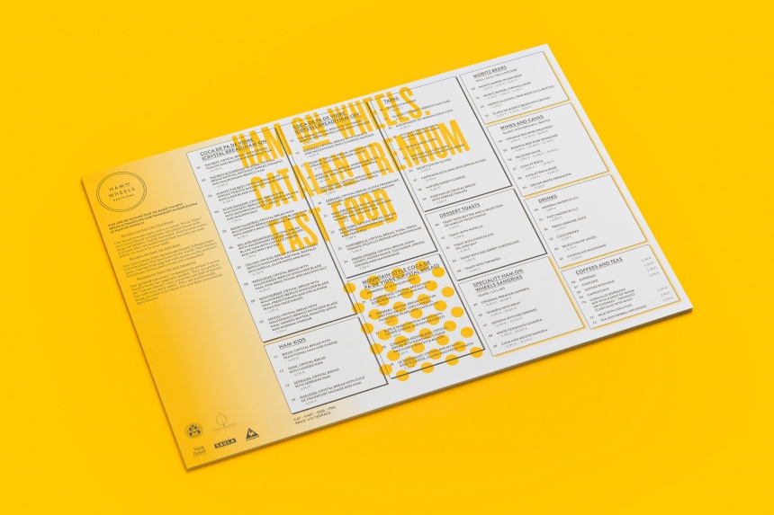
The project gave us a great load of artwork: visuals, infographics, character designs, story boards and icons. Although not published, the material was used to explore different stylistic possibilities for the brand.
