Magnolia
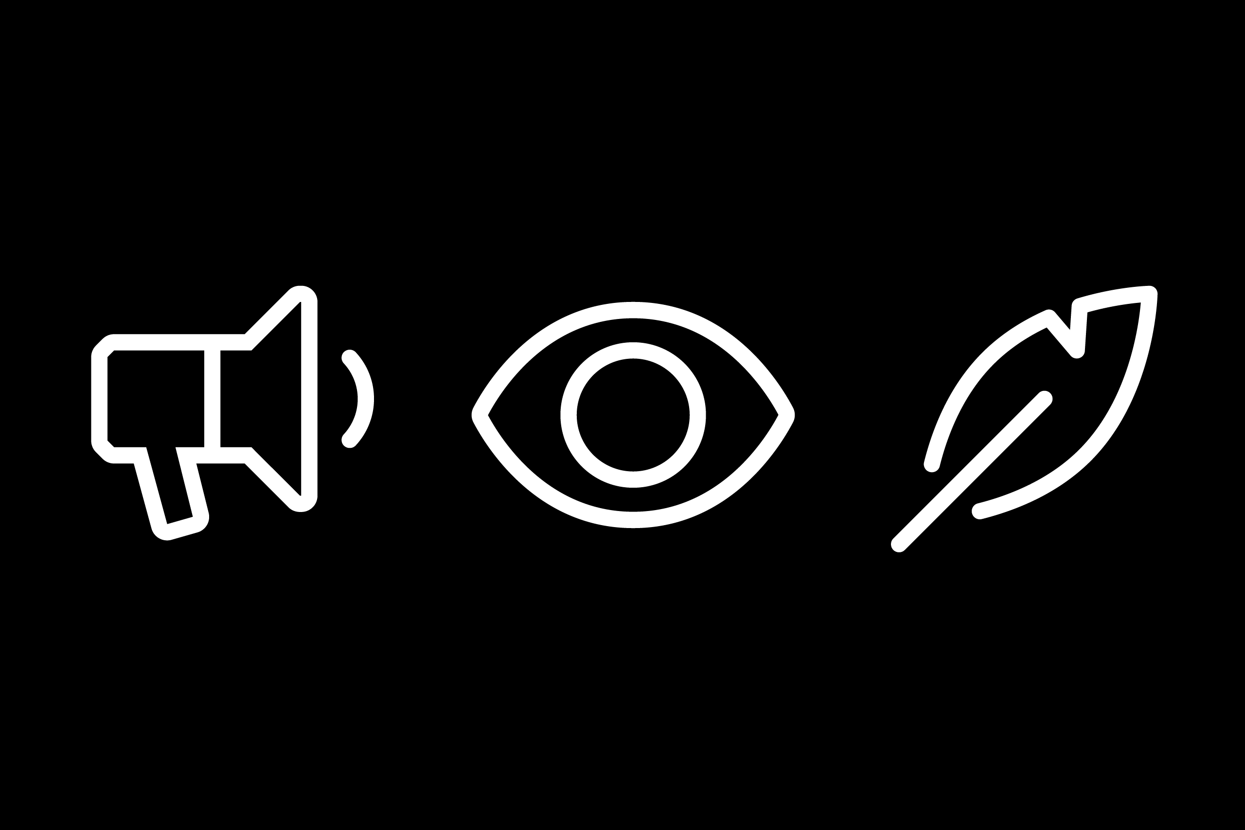
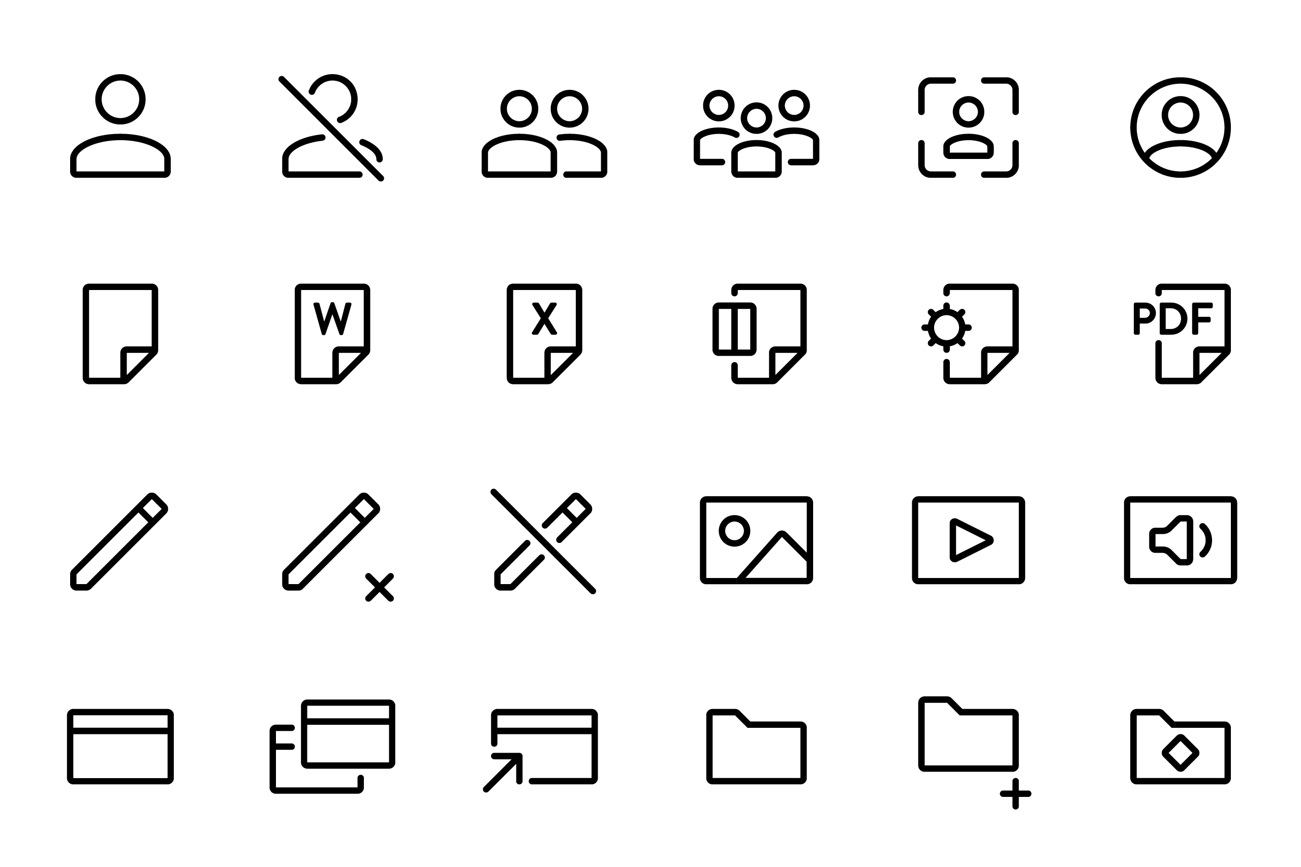
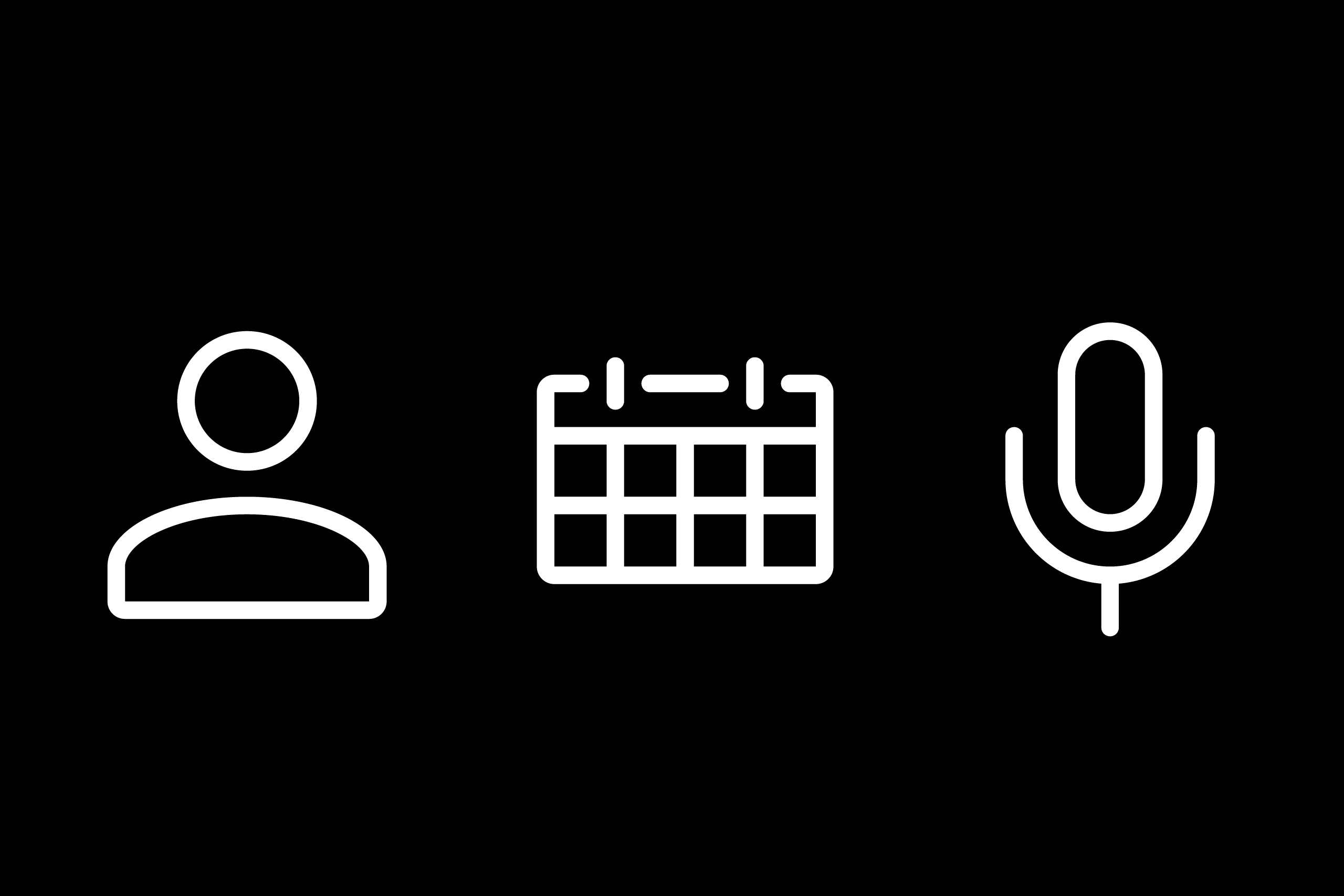
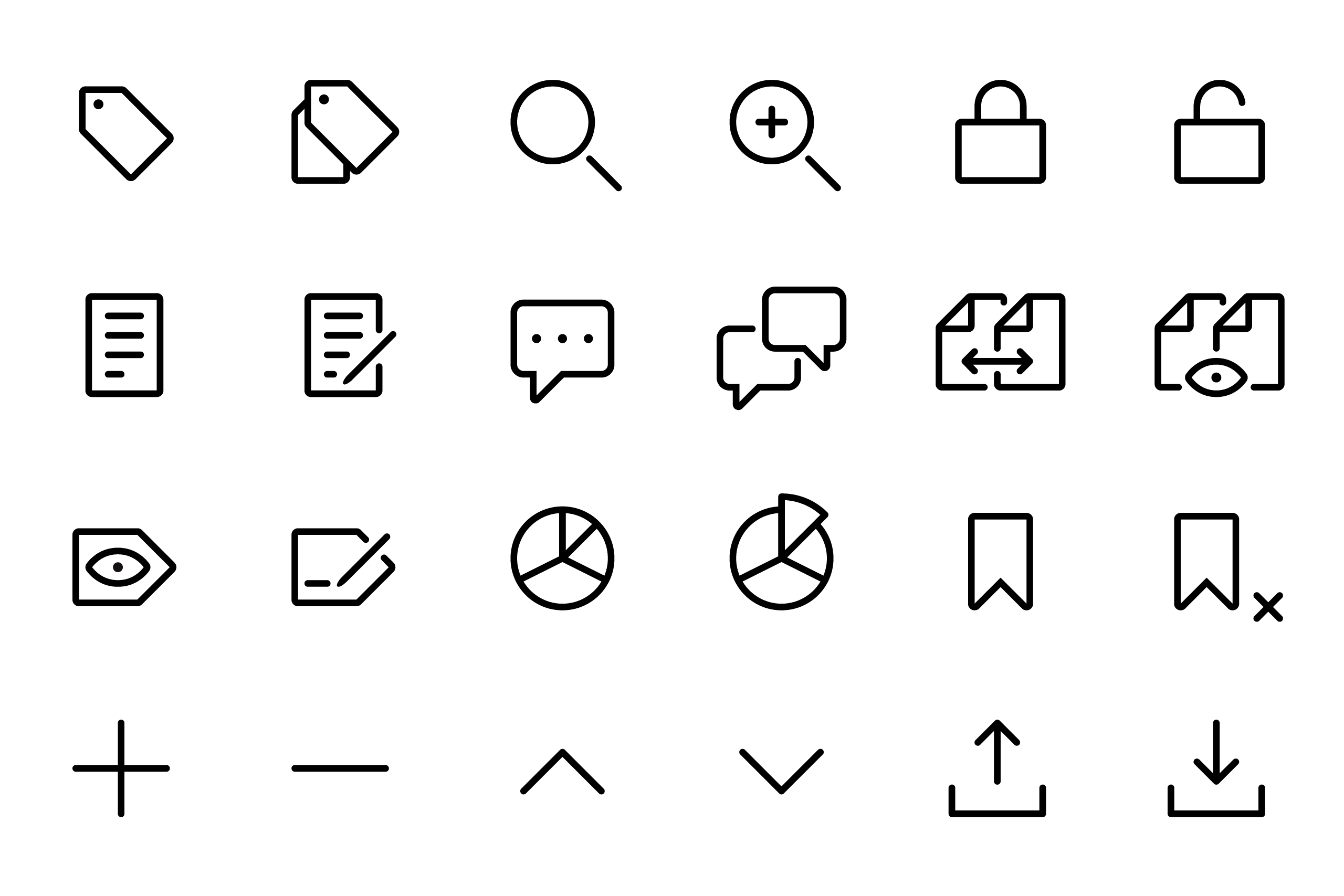
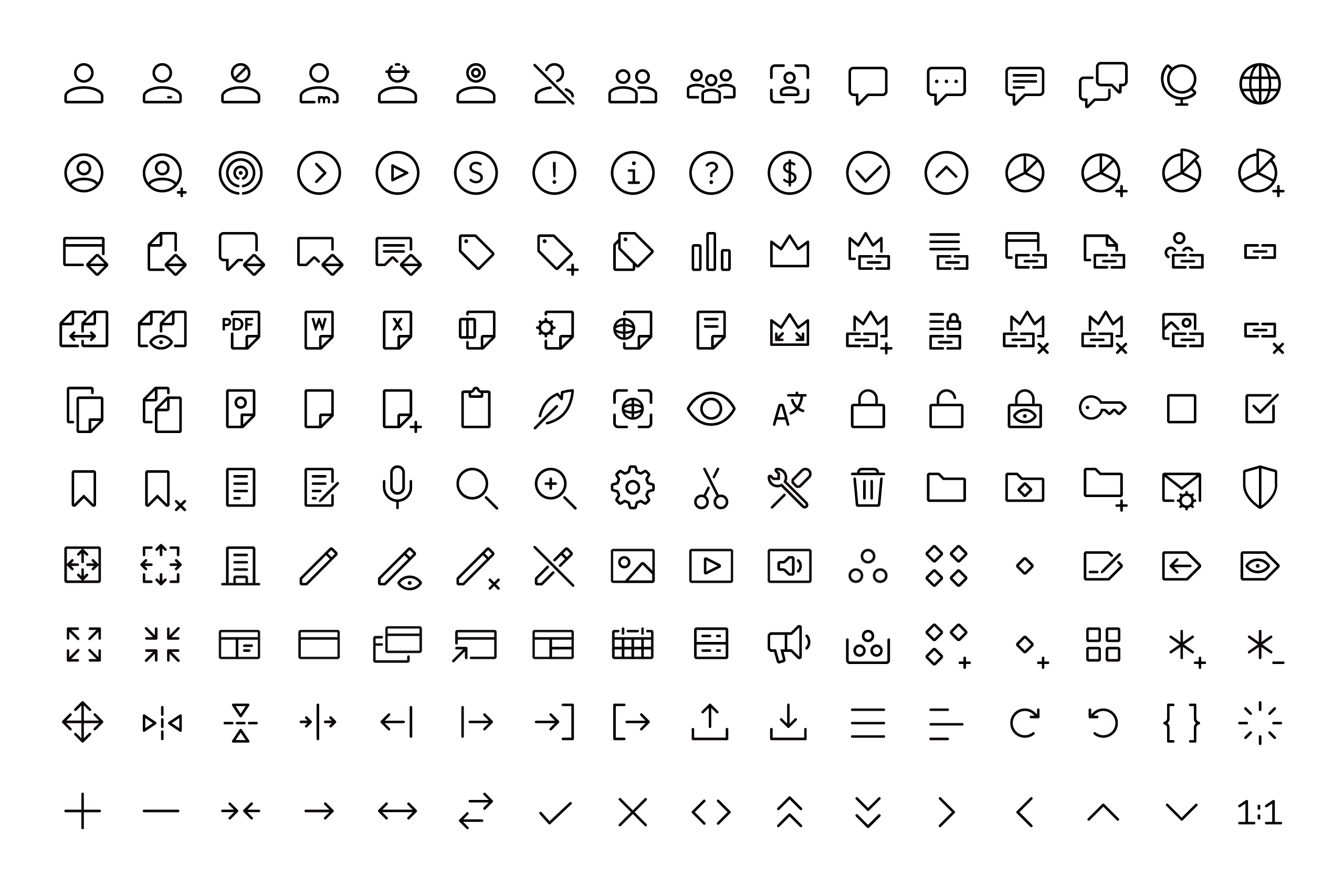
CMS technology company Magnolia commissioned us to design two icon families for their system: Launcher icons and Navigation icons. The first needed more personality, weight and relation with the brand, while the latter had to be extremely functional. Both families needed to work in a crowded environment and at very small sizes.
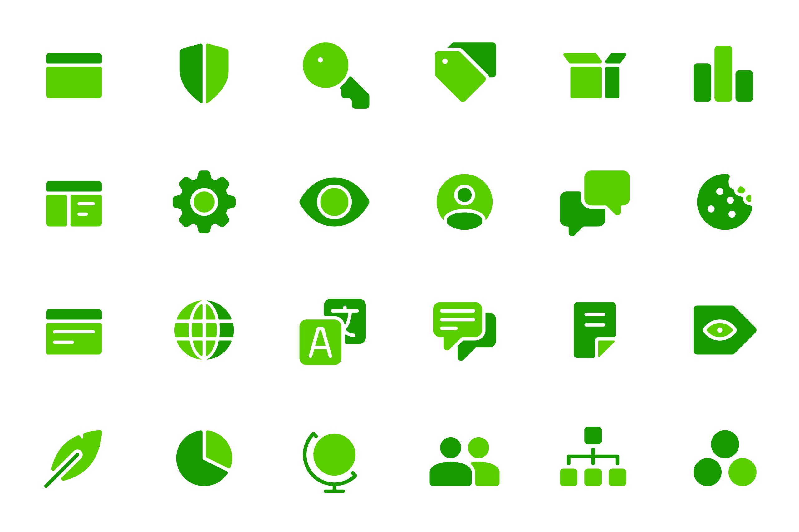

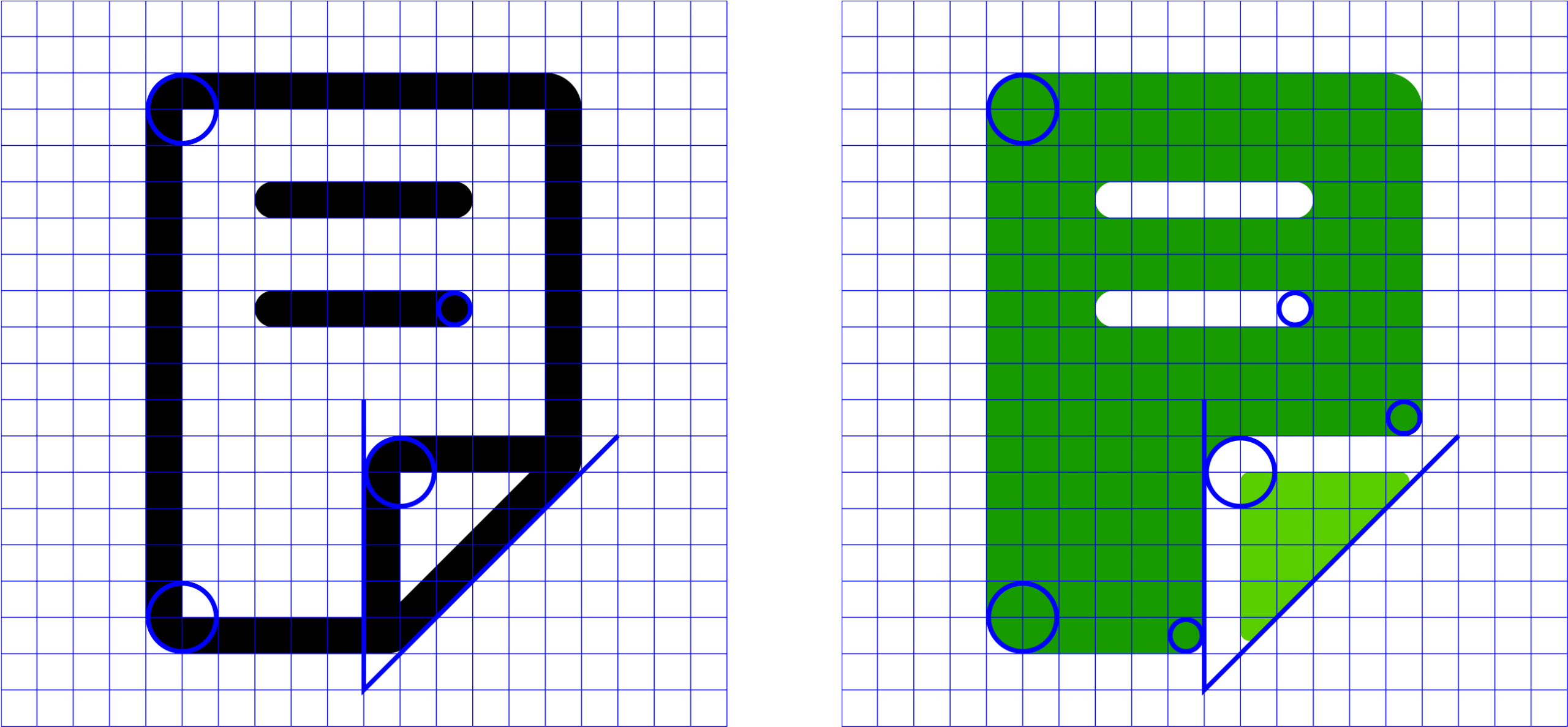
The two families are designed using the same grid and the same construction elements. Using stroke or fill is what makes them different.
